Sakan
سكن
الضيافة / السفر الديني
تصميم هوية بصرية
الضيافة / السفر الديني
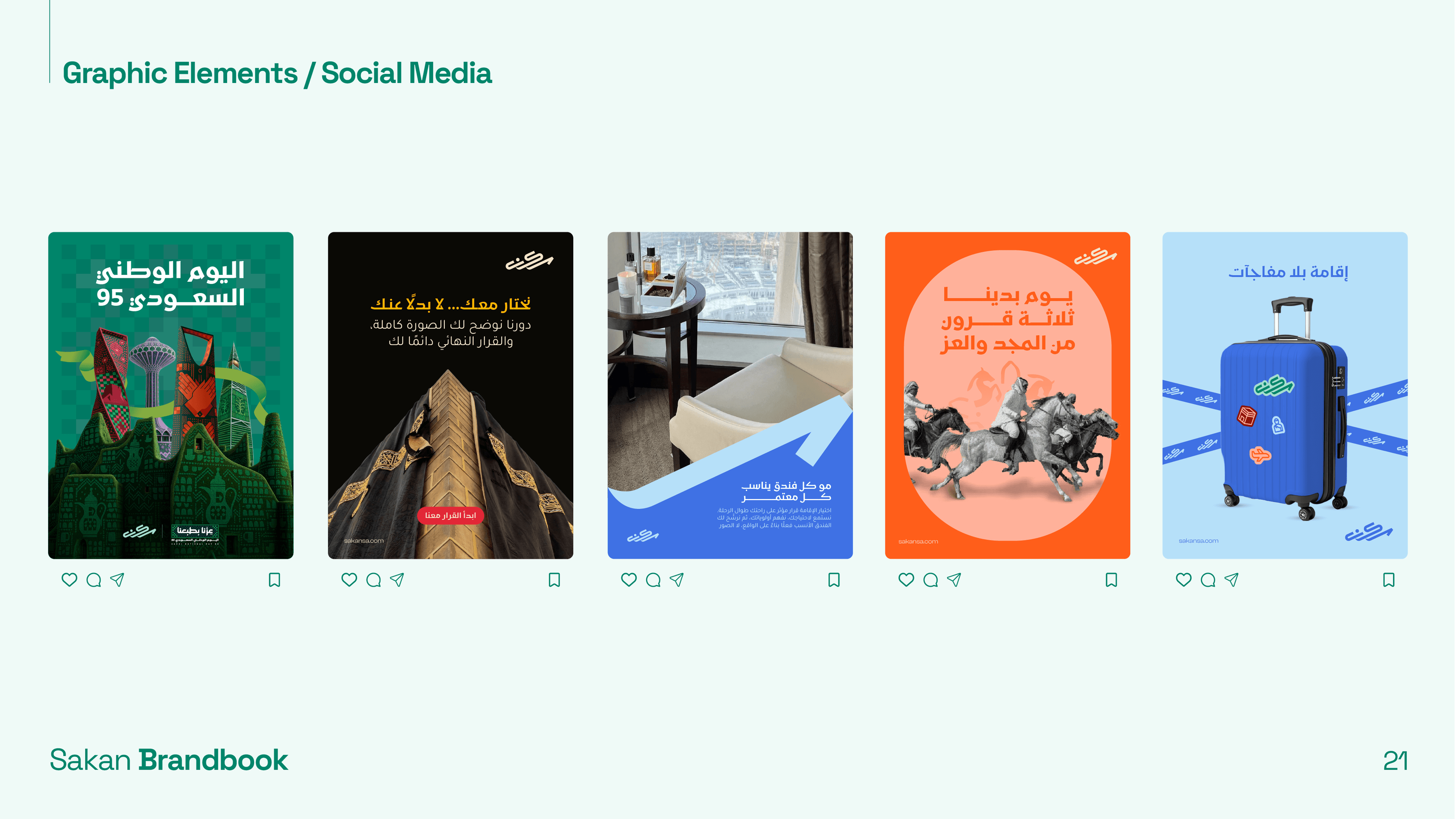
نظام هوية كامل + إدارة تواصل اجتماعي
4-5 أسابيع
الملخّص
سَكَن هي علامة استشارات ضيافة سعودية، تركّز على مساعدة الحُجّاج والمعتمرين في إيجاد الإقامة المناسبة. جاءنا المؤسّسون باحتياج واضح: كانوا يدخلون سوقًا تنافسيًّا مليئًا بوكالات السفر العامة ومنصّات الحجز، واحتاجوا هوية بصرية تميّزهم فورًا.
موقعهم التنافسي كان قويًّا - لم يكونوا مجرّد وسيط حجز فنادق، بل مستشارين يطابقون الحاج مع الإقامة المناسبة لاحتياجاته. لكن لم تكن لديهم هوية بصرية تحمل هذه الرسالة.
التحدّي
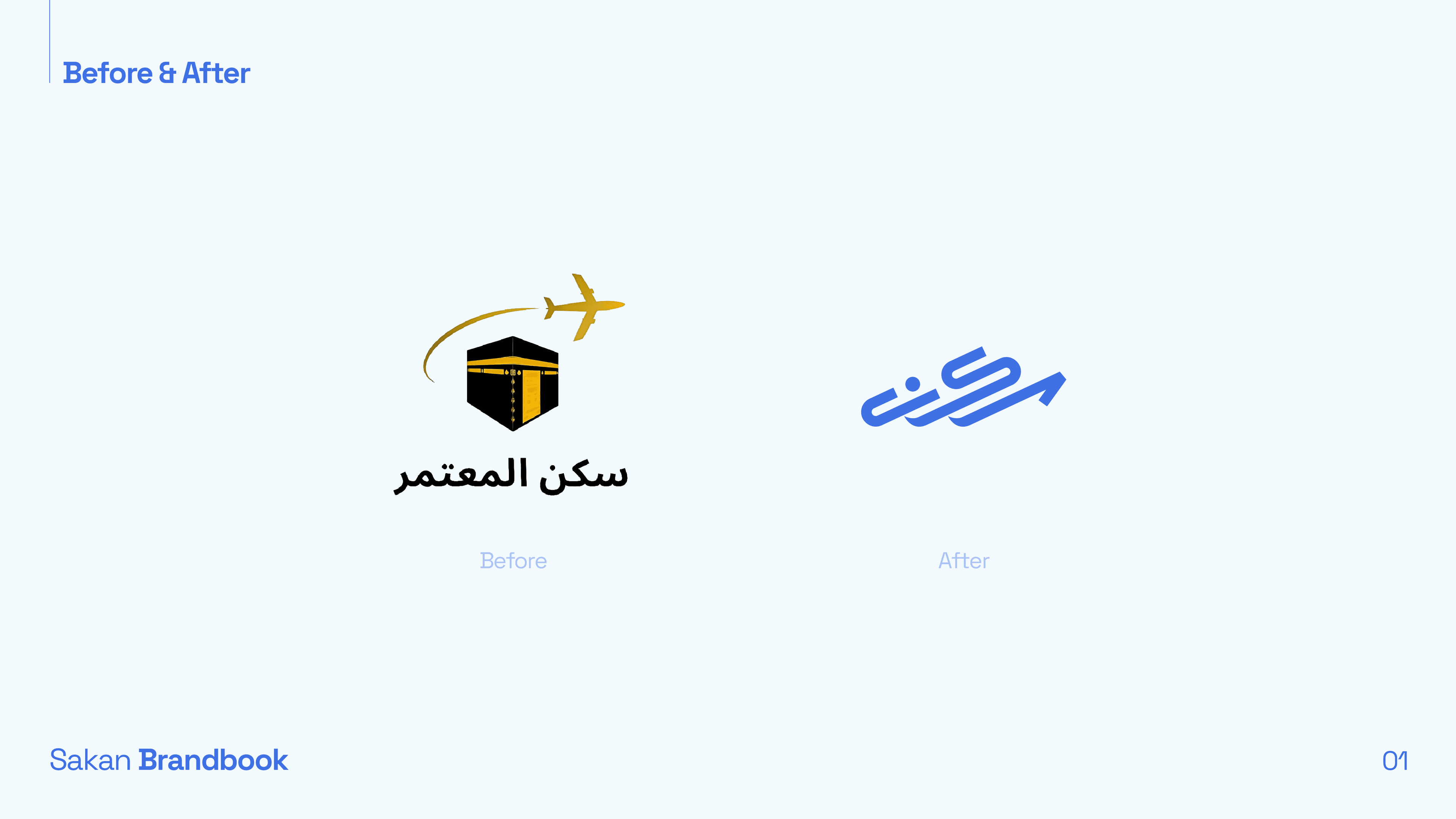
سوق إقامة الحج والعمرة يعاني من مشكلة بصرية محدّدة: معظم العلامات تبدو متشابهة. ألوان ذهبية وخضراء، صور مساجد عامة، خطوط عربية مزخرفة - لغة بصرية تجعل كل علامة قابلة للاستبدال.
سَكَن احتاجت أن تبدو مختلفة دون أن تبدو غير محترمة. حديثة دون فقدان الأصالة الثقافية. جديرة بالثقة دون أن تكون مملّة. هذا كان التوتّر الإبداعي الذي كان علينا حلّه.
تفكيرنا
بدأنا بدراسة المشهد التنافسي - ليس منافسي سَكَن المباشرين فقط، بل اللغة البصرية الأوسع لعلامات السفر والضيافة التي يتعامل معها الحُجّاج. حدّدنا المساحة البيضاء: علامة تبدو نظيفة وحديثة وواثقة، تستخدم إشارات الثقة من صناعة الضيافة بدلاً من فئة السفر الديني.
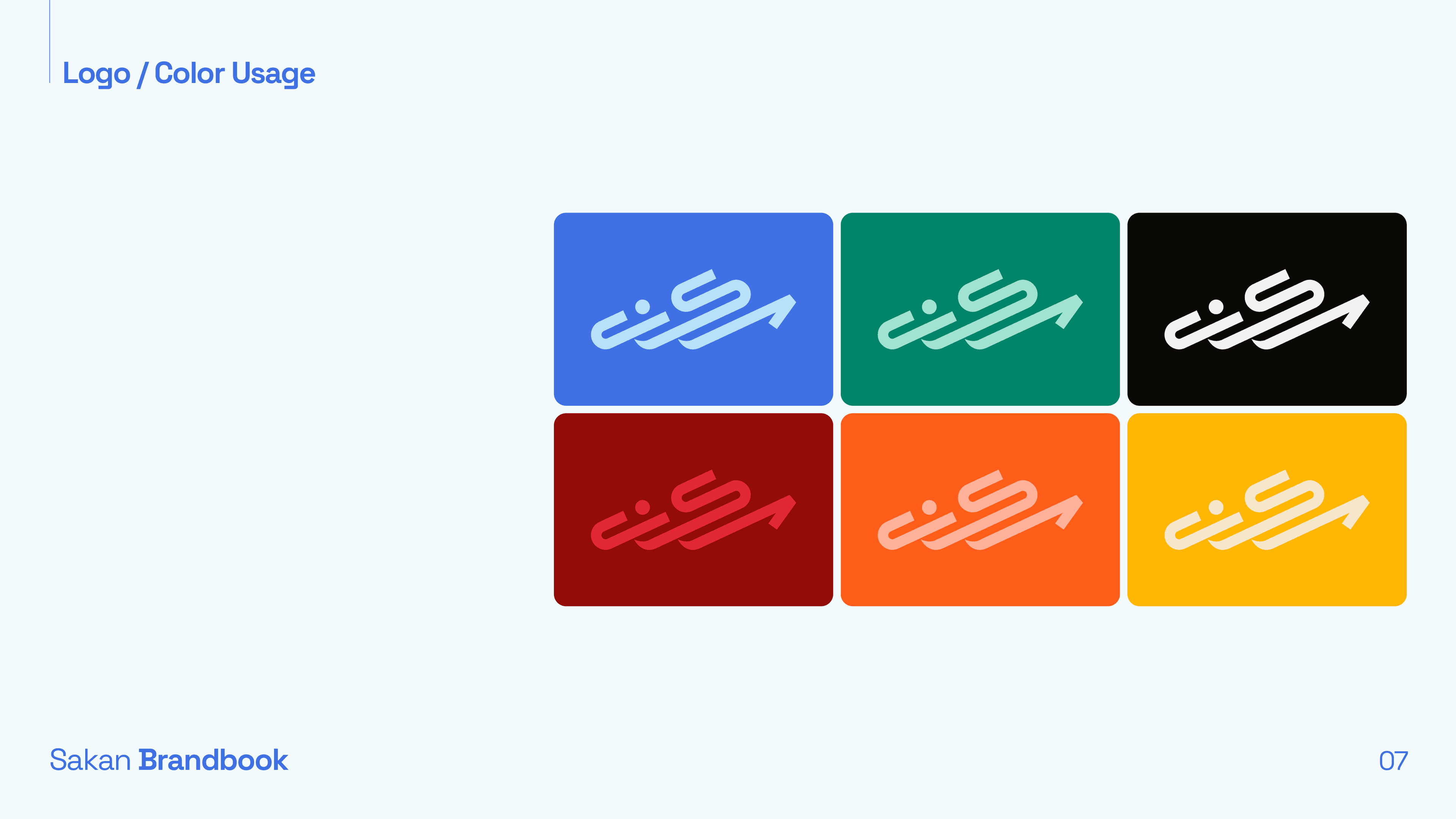
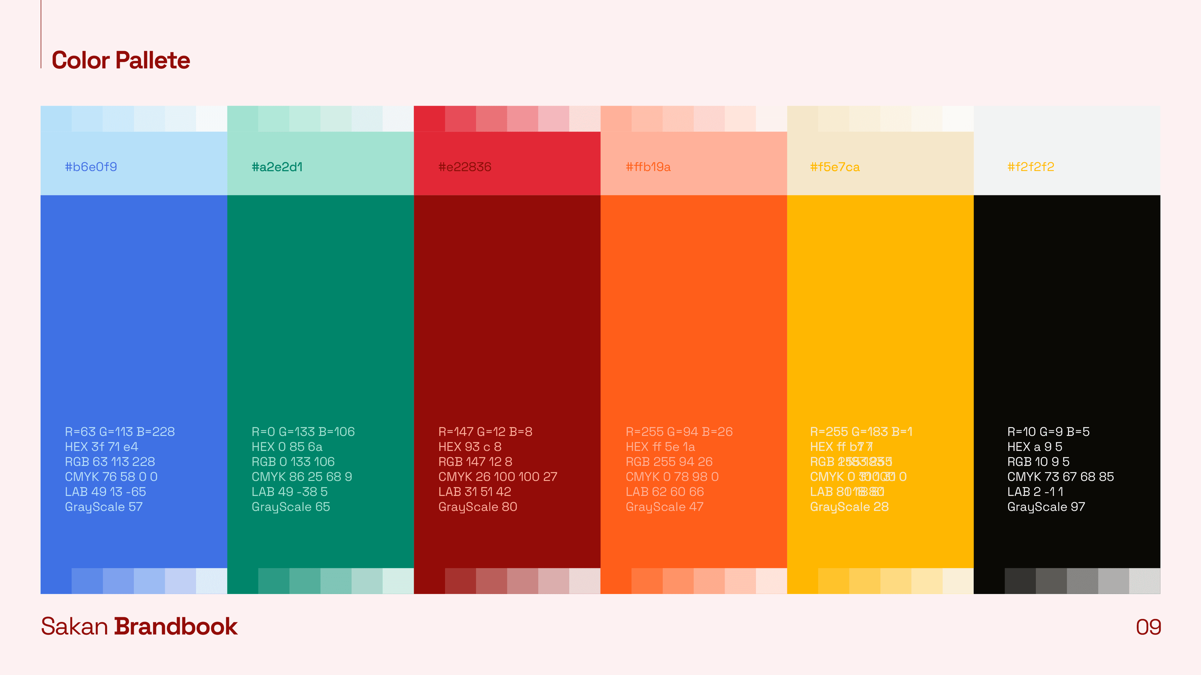
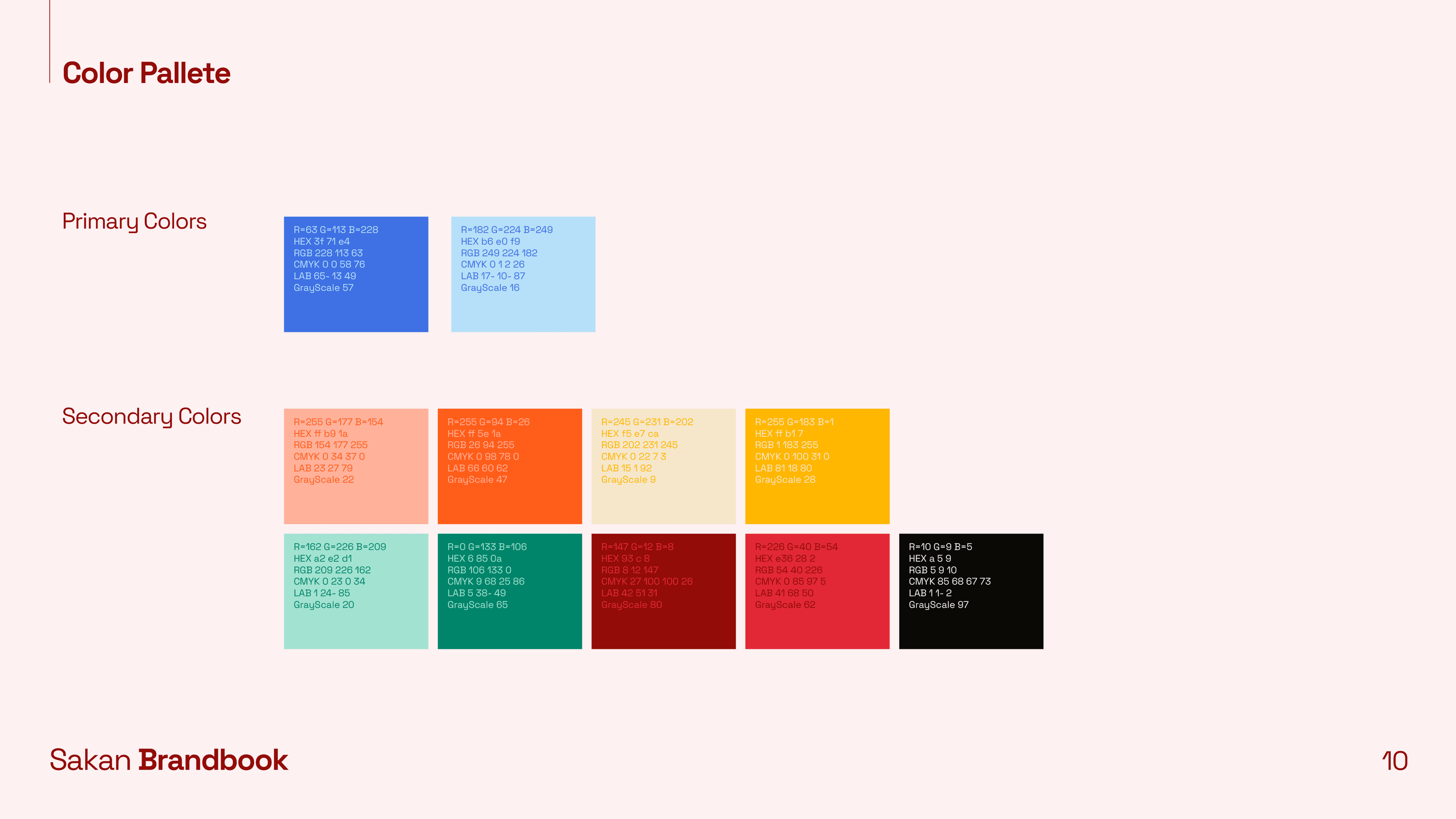
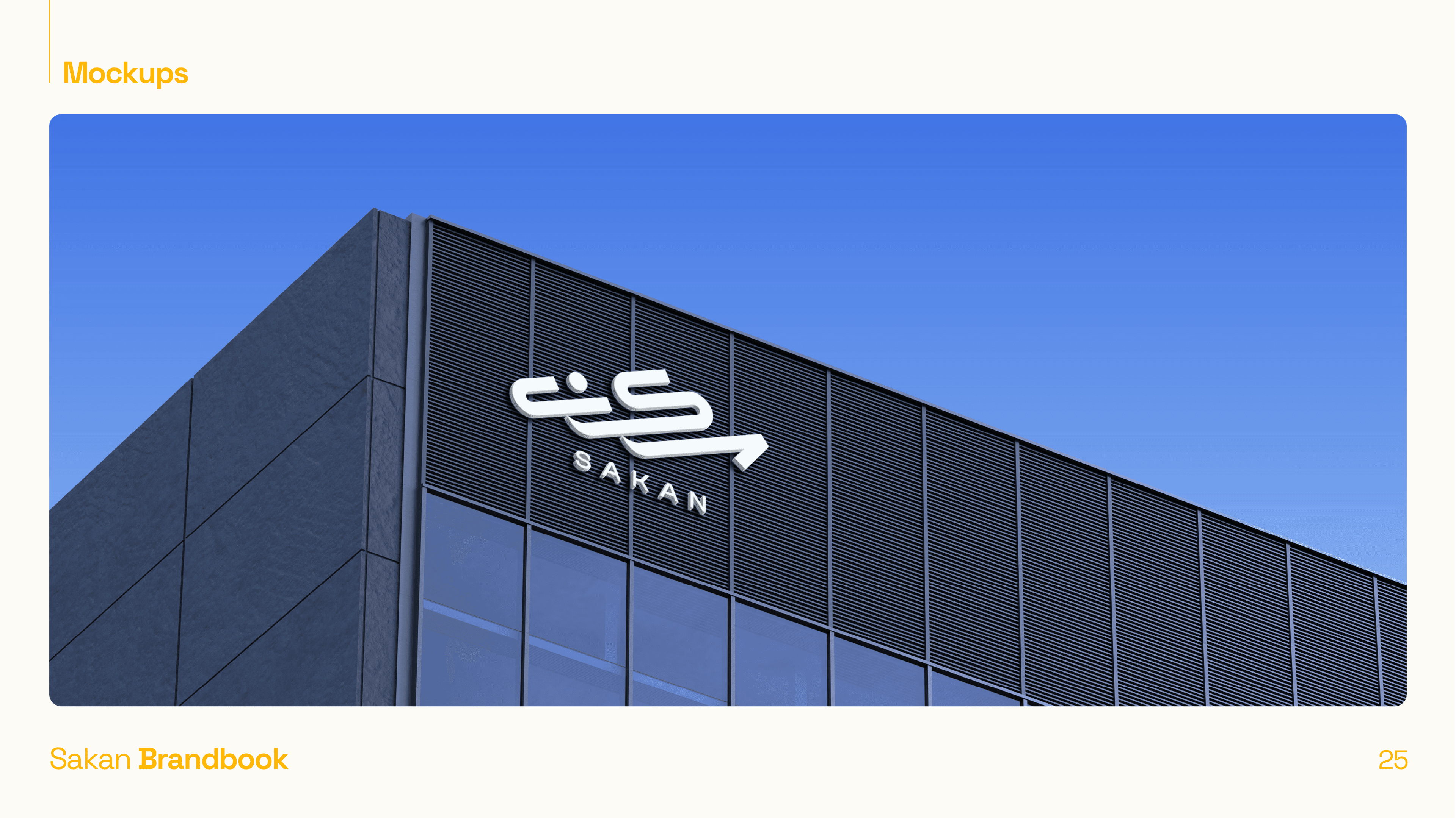
- 01اخترنا لوحة ألوان تهيمن عليها الأزرق للدلالة على الموثوقية والهدوء - متجنّبين عمدًا كليشيه الذهبي/الأخضر في الفئة
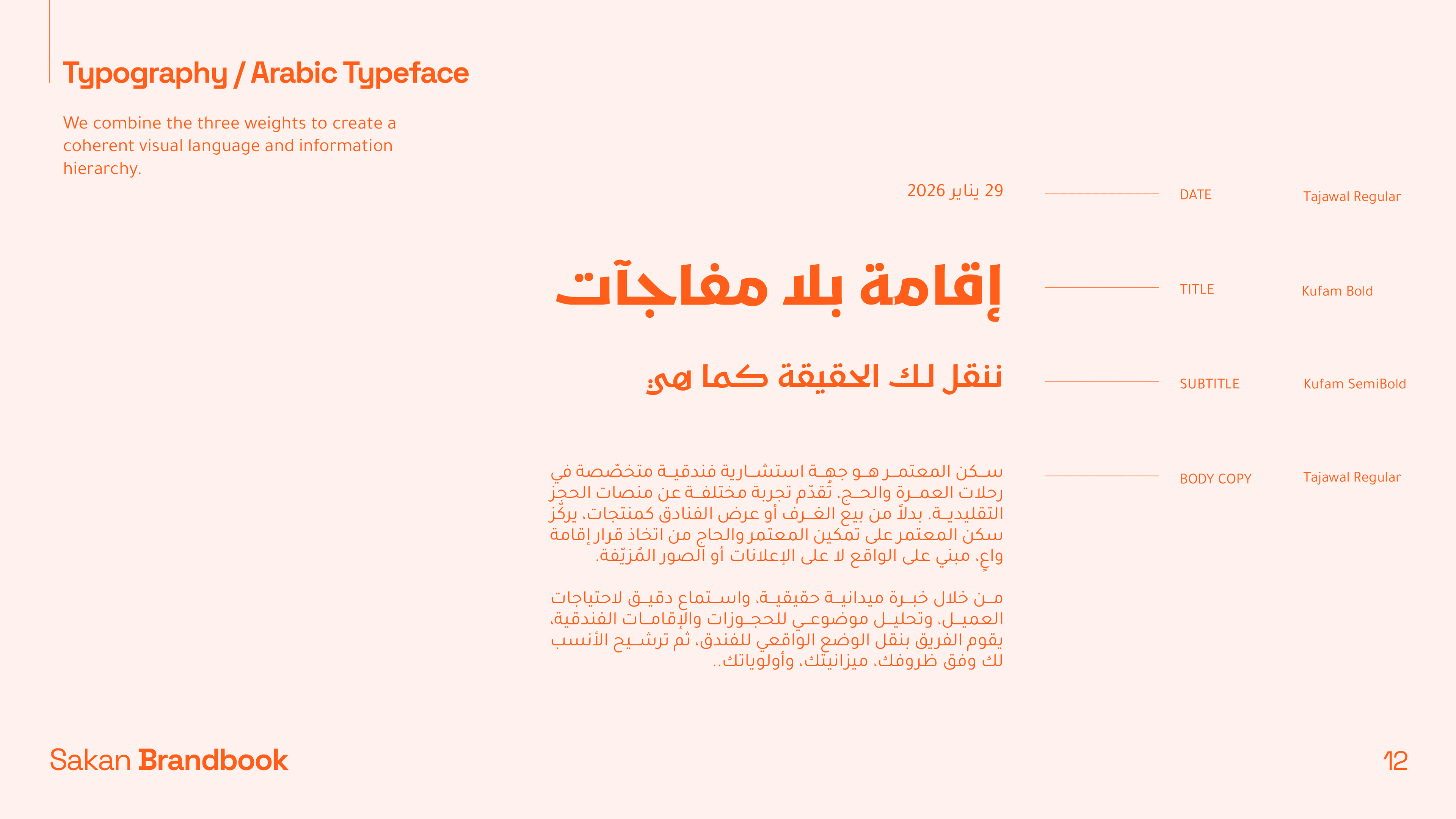
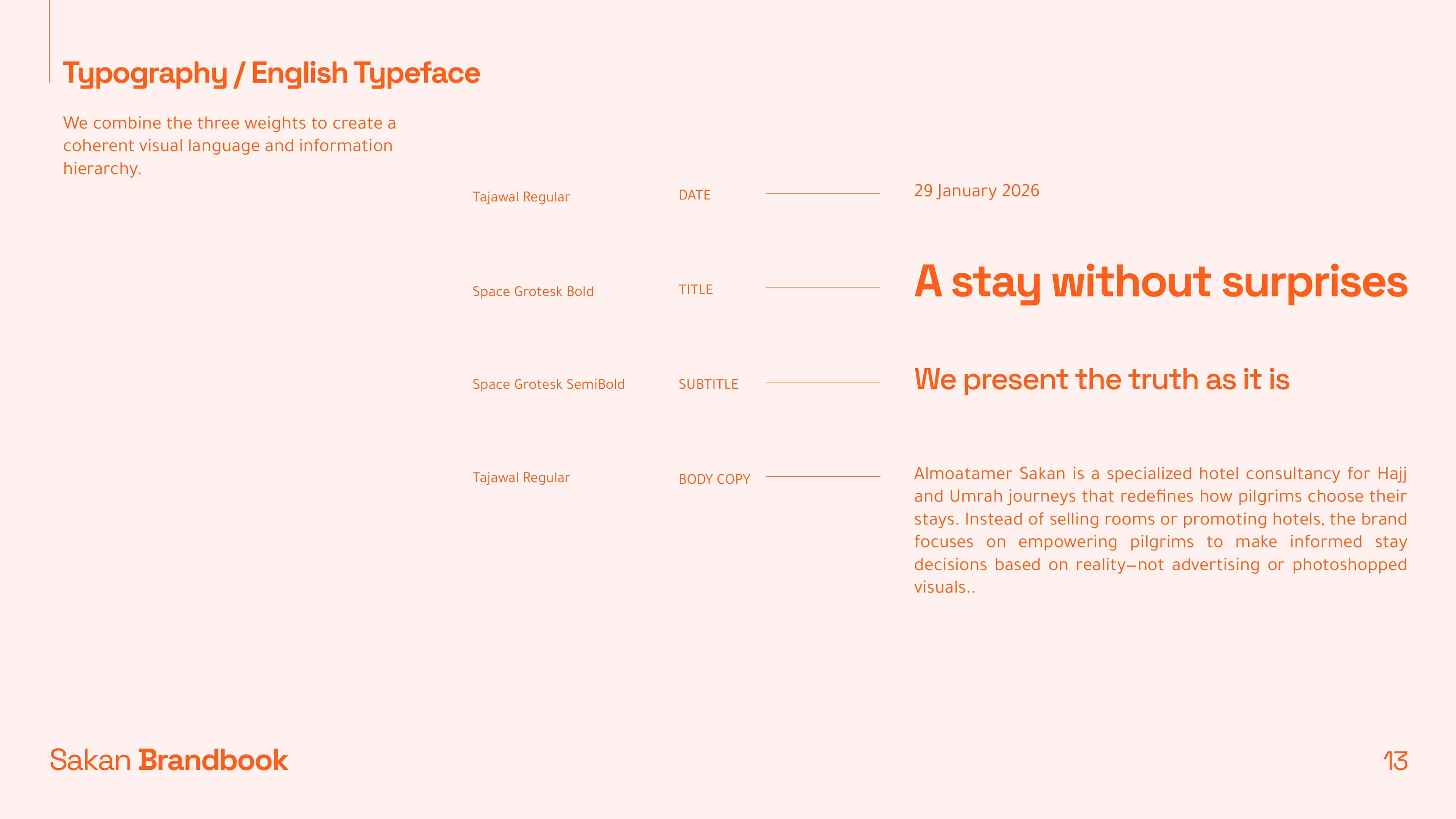
- 02صمّمنا شعارًا عربيًّا أولاً يبدو معاصرًا لكنّه متجذّر ثقافيًّا، وليس شعارًا لاتينيًّا أُضيفت إليه العربية كفكرة لاحقة
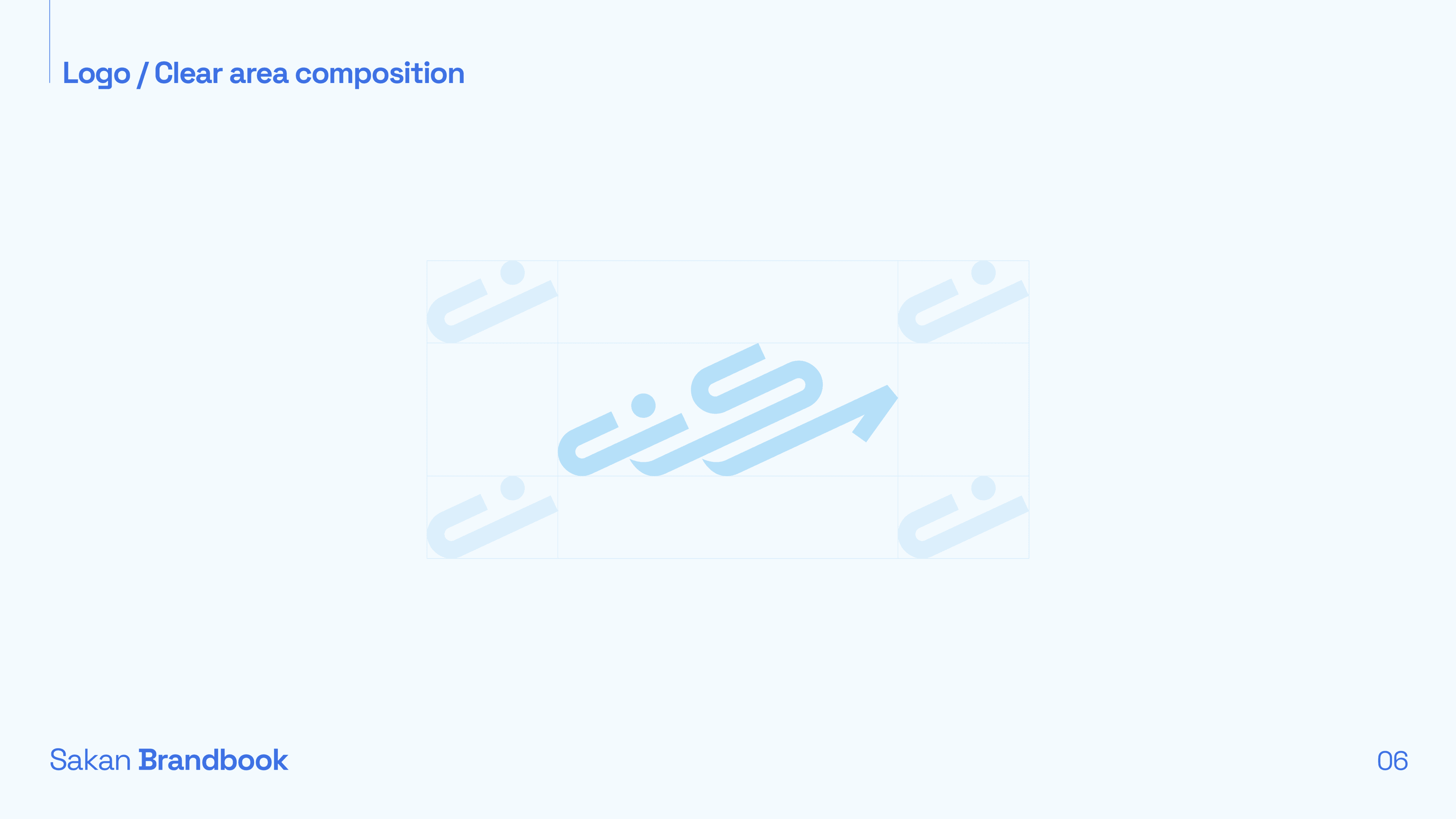
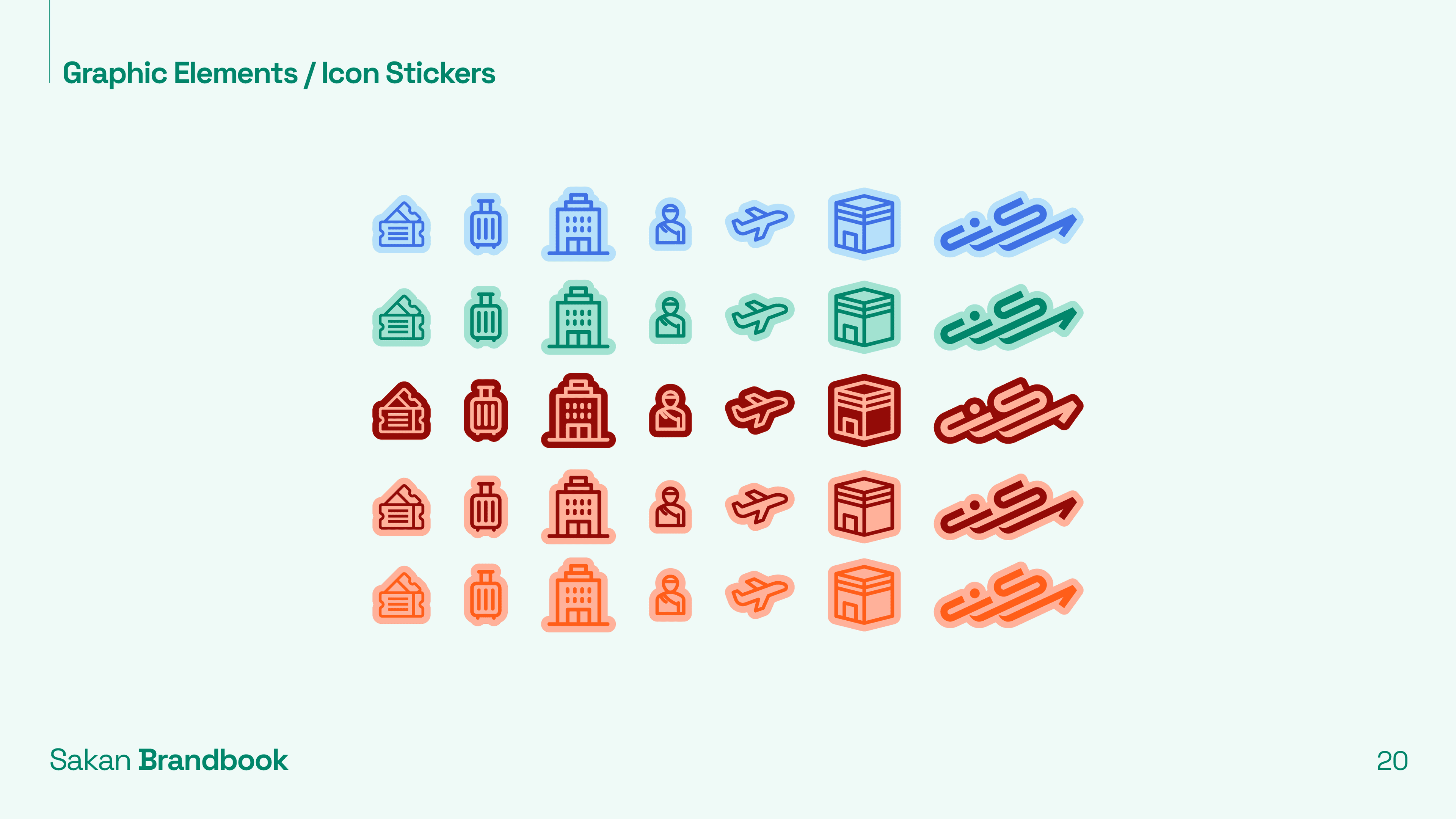
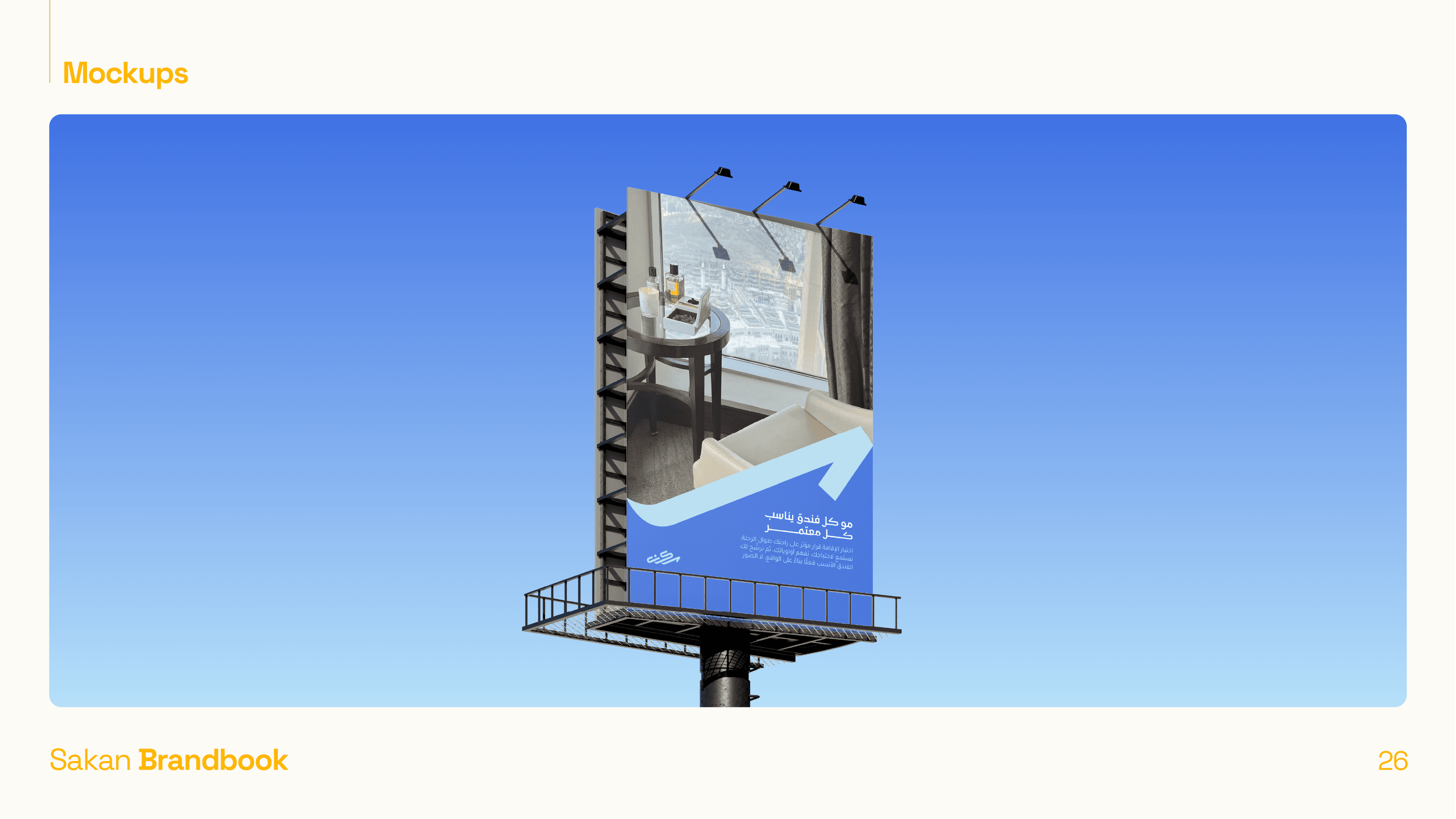
- 03أنشأنا نظامًا بصريًّا مبنيًّا حول فكرة الوضوح والتوجيه - لأن وعد سَكَن الأساسي هو إزالة الحيرة من البحث عن الإقامة
- 04طوّرنا رسائل العلامة بالعربية والإنجليزية تركّز على تجربة الحاج: "نختار معك، لا بدلاً عنك"
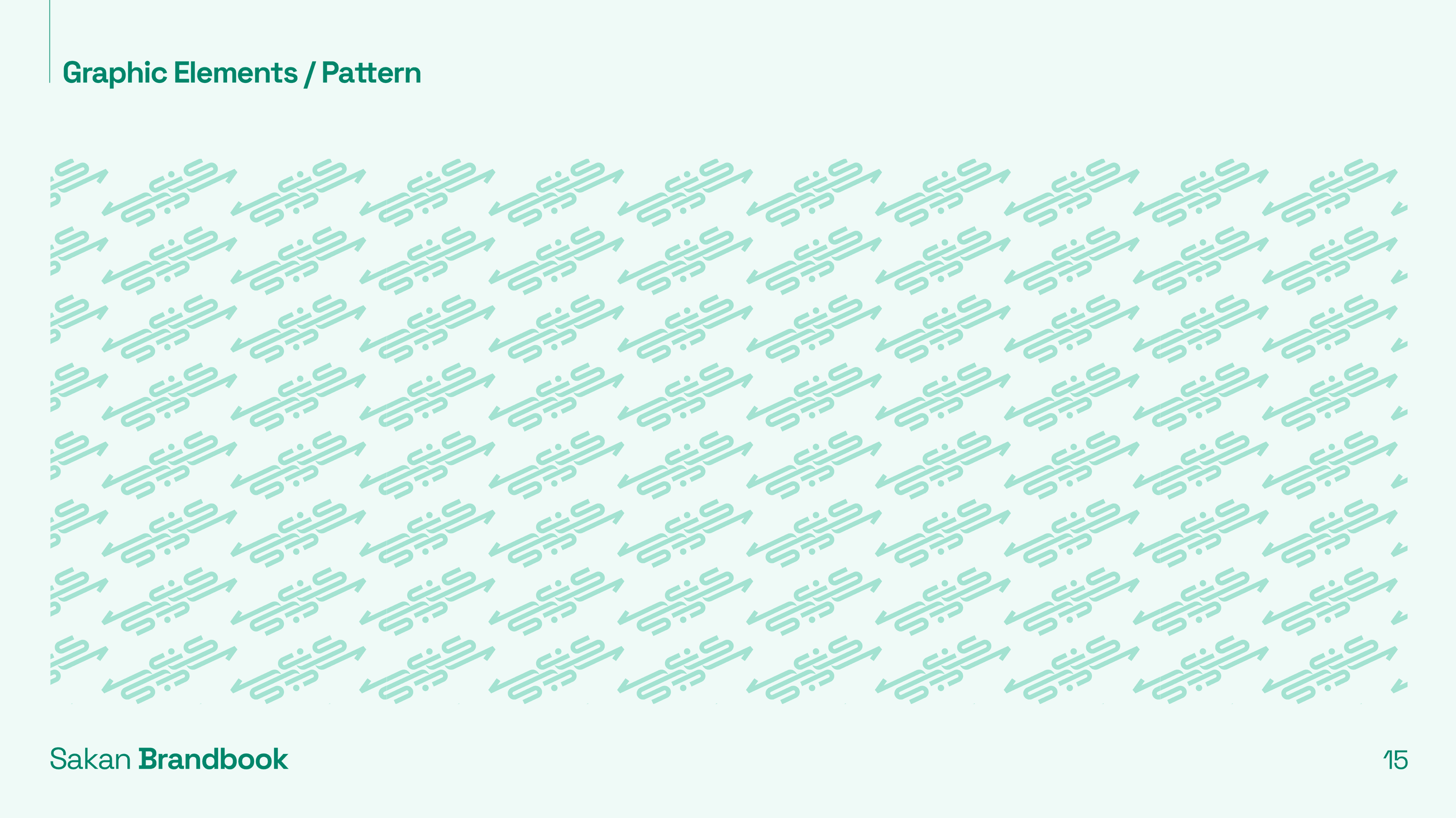
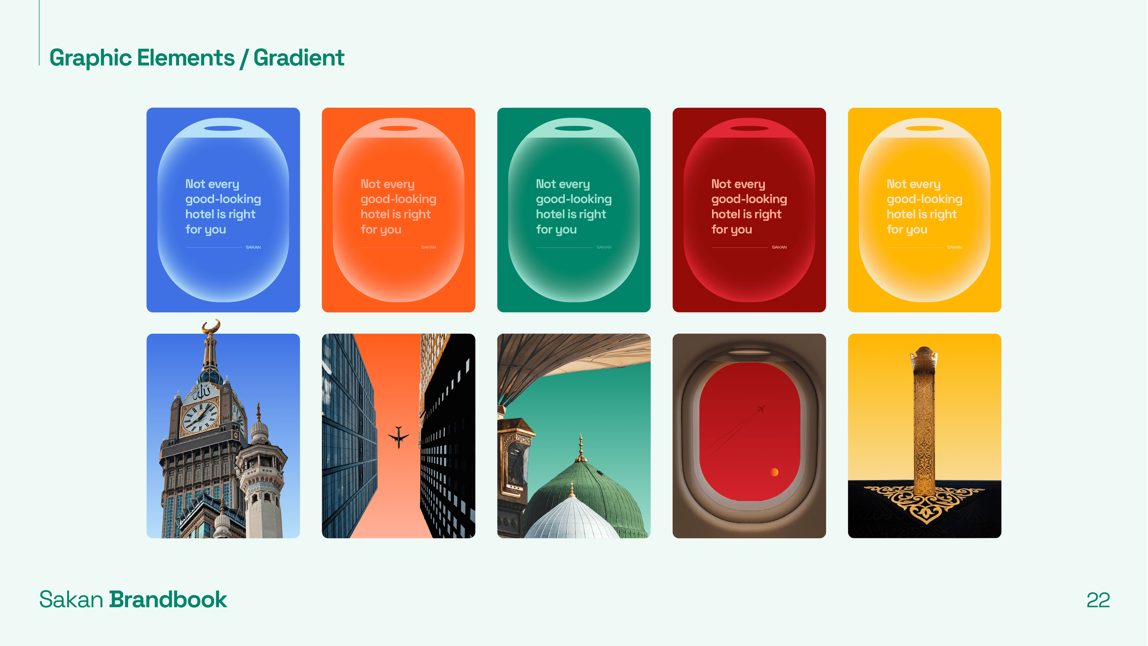
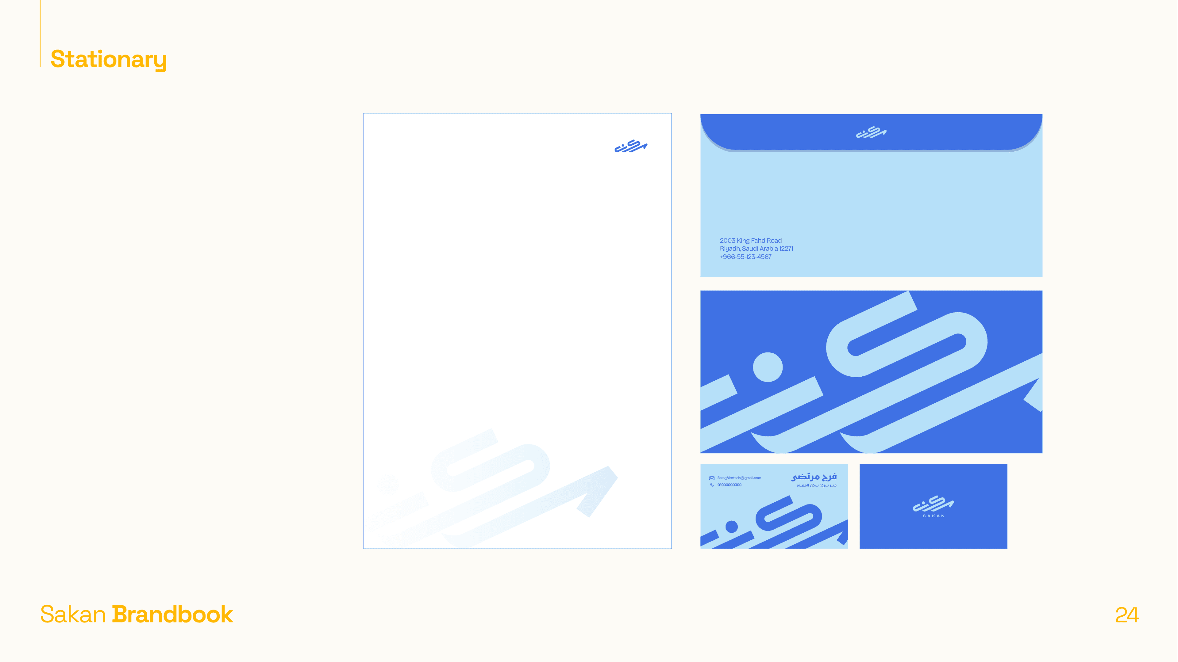
ما سلّمناه
النتيجة
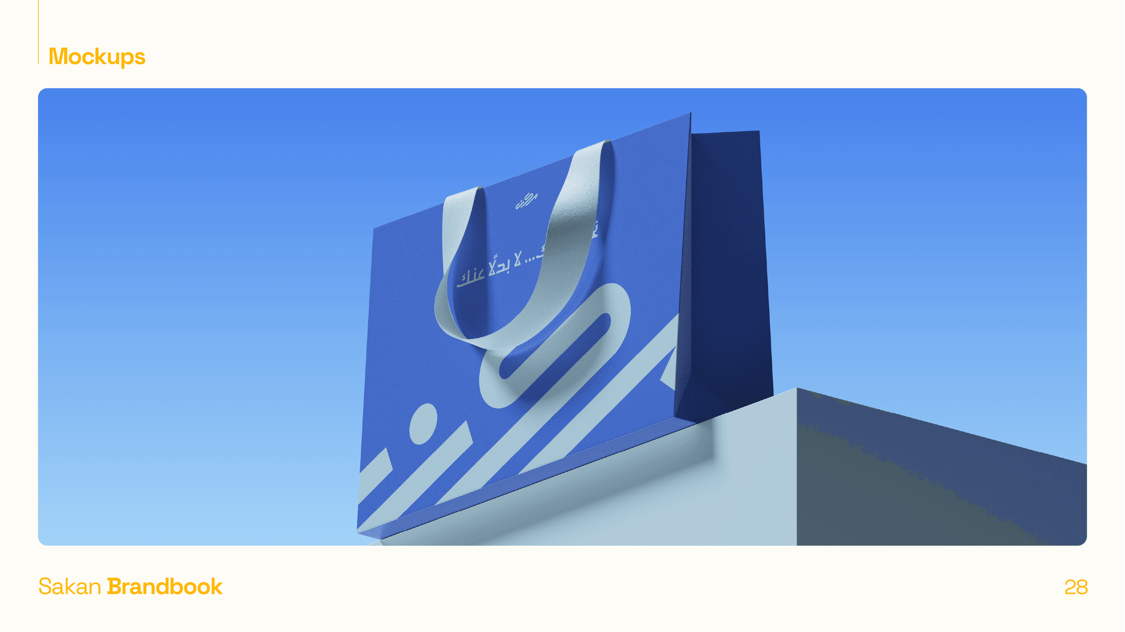
انطلقت سَكَن بهوية بصرية لا تشبه منافسيها إطلاقًا - وهذا كان الهدف. أعطاهم النظام لغة بصرية كاملة تعمل عبر كل نقطة تماس، من منشور تواصل اجتماعي إلى بطاقة أمتعة تُسلَّم للحاج عند تسجيل الدخول.
تسليم نظام العلامة الكامل واعتماده ضمن الجدول الزمني المحدّد
اعتمد العميل الدليل عبر جميع نقاط التماس من اليوم الأول - بدون أي انحراف
وضعت الهوية سَكَن كاستشارة متميّزة وحديثة في فئة تسيطر عليها الوكالات العامة
كل تطبيق - من المنشورات إلى اللافتات - يبدو كأنه نفس العلامة، وهذا الهدف الكامل من النظام
استخدام الأزرق بدلاً من الذهبي/الأخضر المتوقّع.
كان كسرًا متعمّدًا لعُرف الفئة جعل سَكَن معروفة فورًا. كان العميل حذرًا في البداية، لكن حين رأى النظام الكامل مُطبّقًا، التميّز تكلّم عن نفسه.
ملف العرض الكامل


Neemo
التجارة الإلكترونية / التجزئة