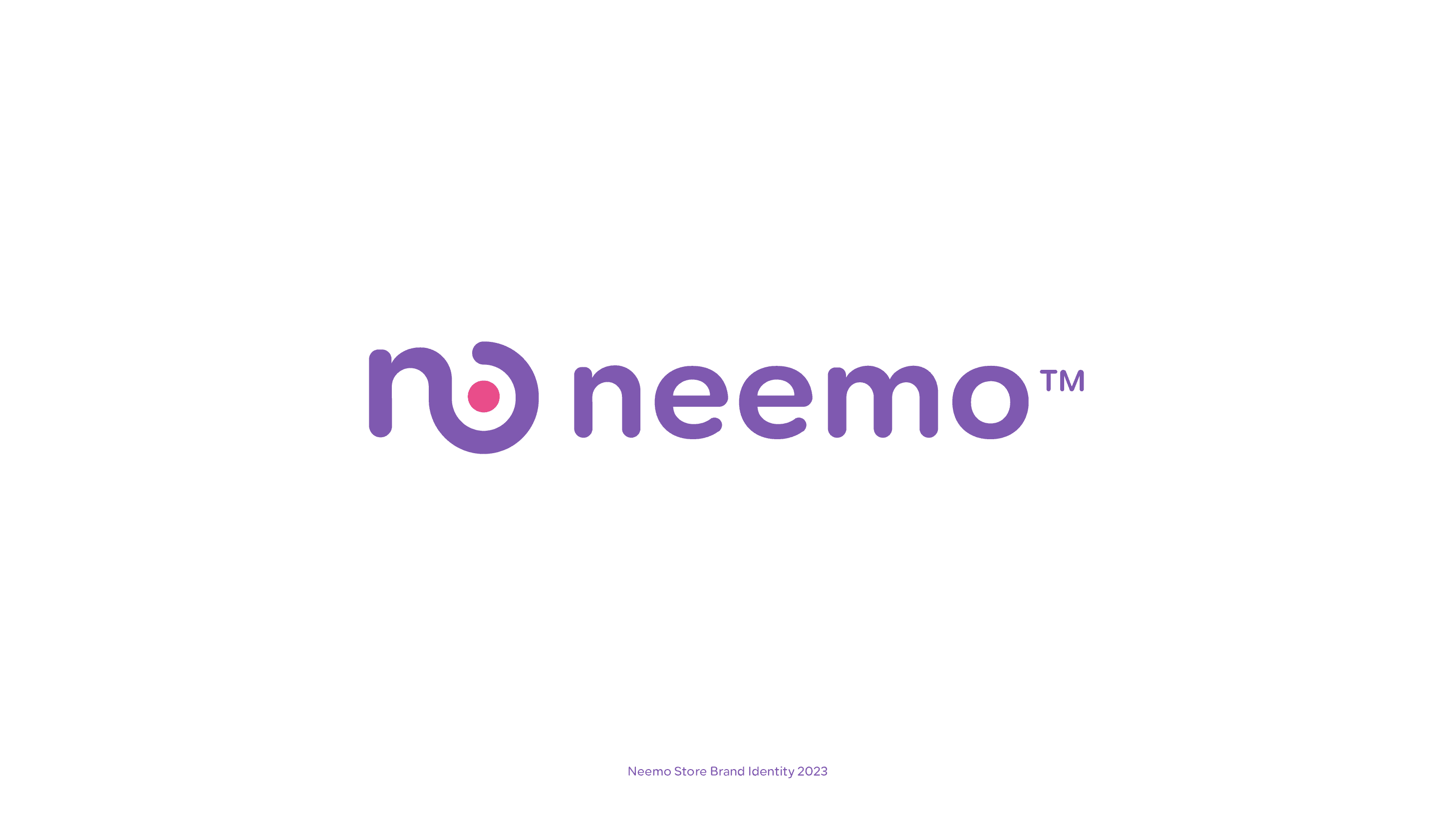
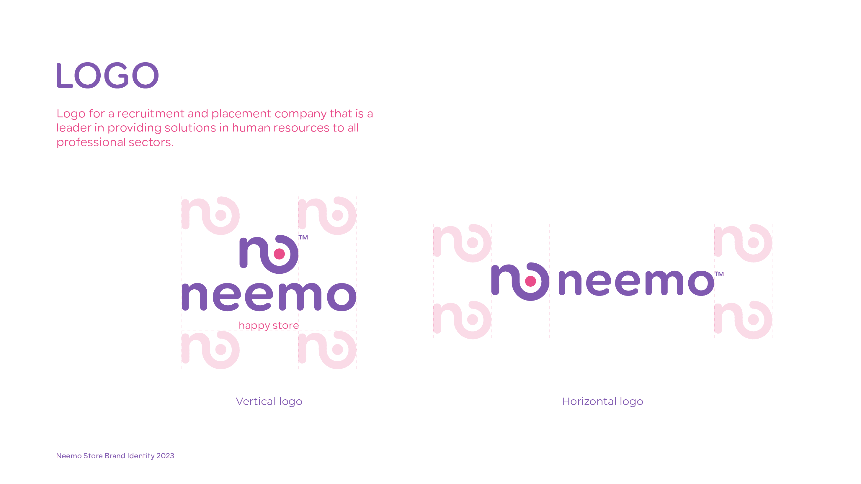
Neemo
نيمو
التجارة الإلكترونية / التجزئة
هوية بصرية + تغليف
التجارة الإلكترونية / التجزئة
هوية كاملة، تغليف، إدارة تواصل اجتماعي
4-6 أسابيع
الملخّص
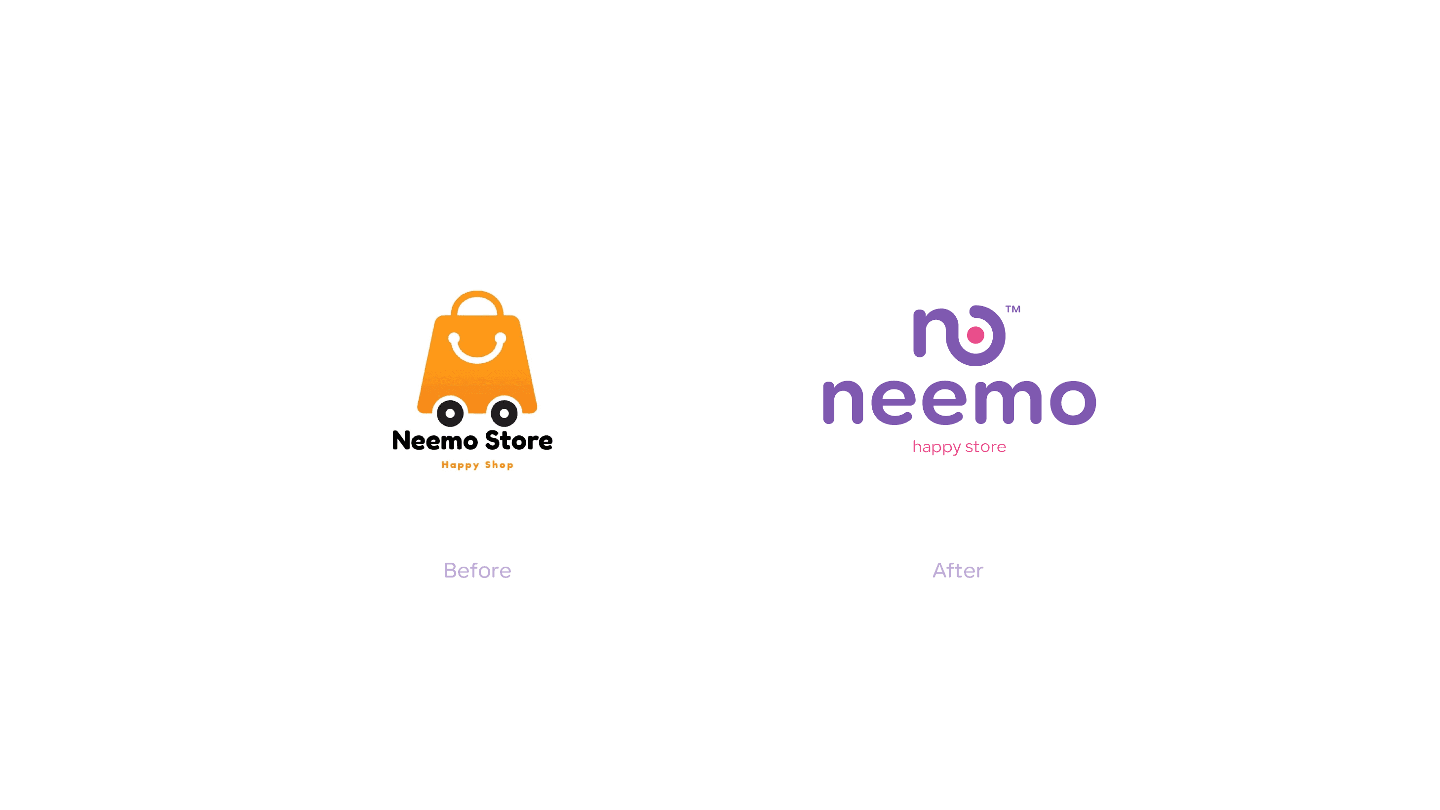
نيمو هو متجر إلكتروني - "المتجر السعيد" الذي يبيع مزيجًا منتقى من المنتجات. أراد المؤسّسون علامة تبدو ممتعة ونابضة بالحياة ولا تُنسى فورًا. كانوا يُطلقون في سوق تجارة إلكترونية مزدحم حيث معظم المنافسين يُنسَون بصريًّا، واحتاجوا هوية تجعل الناس يتوقّفون عن التمرير ويتذكّرون الاسم.
التحدّي
علامات التجارة الإلكترونية تعاني من مشكلة هوية محدّدة: معظمها يبدو قابلاً للاستبدال. شعارات بسيطة، لوحات ألوان آمنة، صور جاهزة. النتيجة بحر من التشابه حيث المميّز الوحيد يصبح السعر - وهذا بالضبط السباق الذي أراد نيمو تجنّبه.
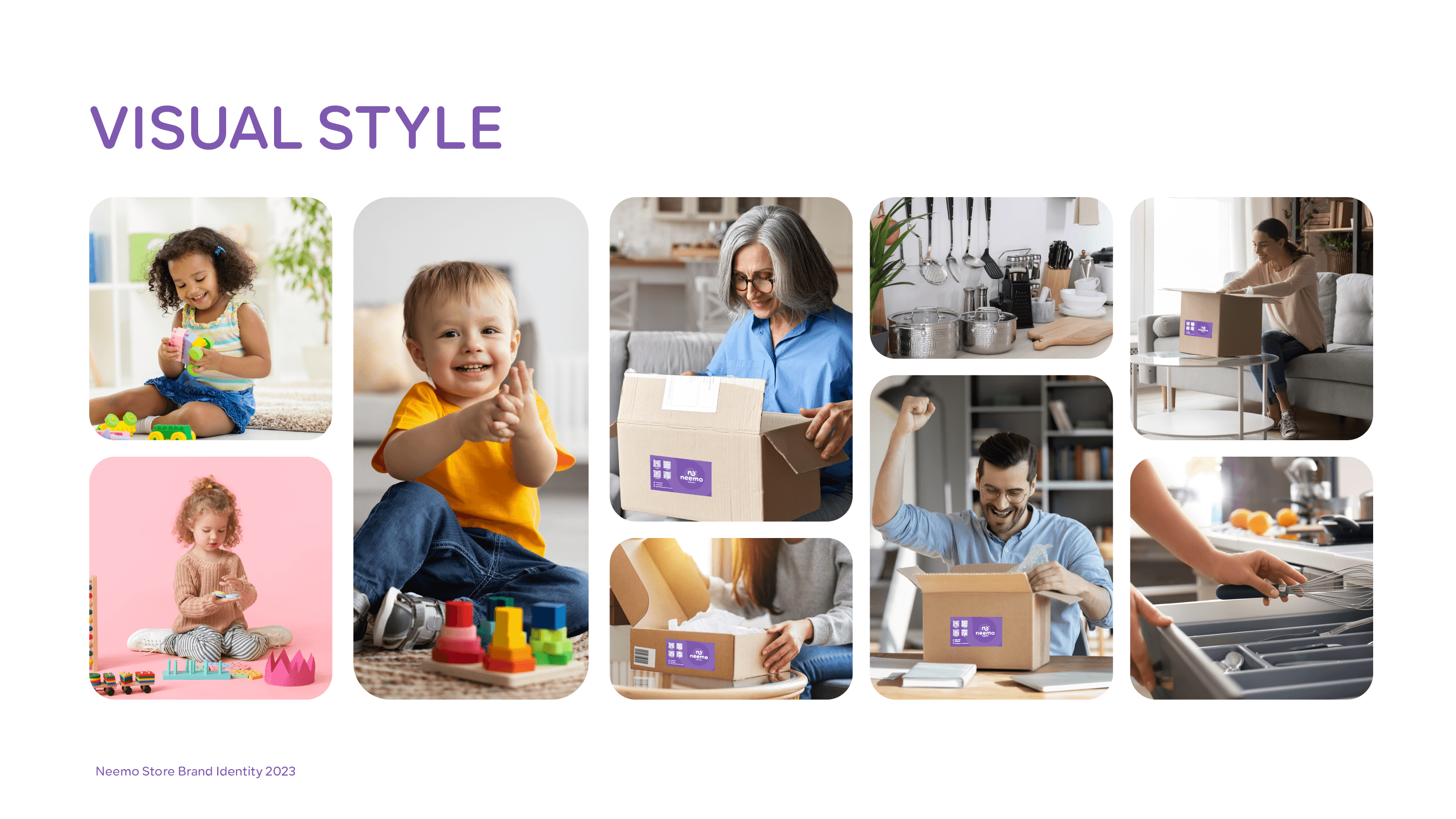
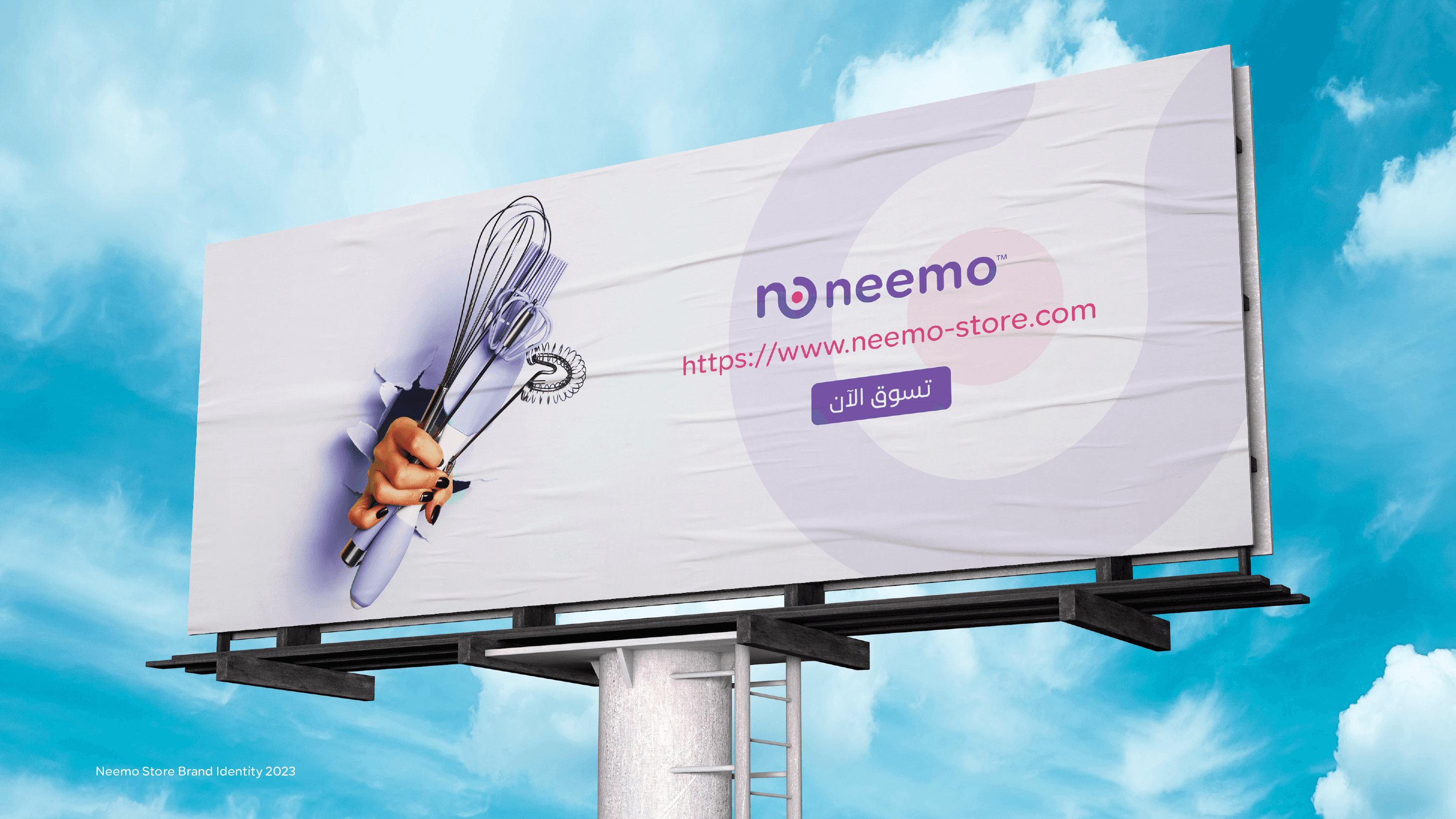
التحدّي الإبداعي كان إيجاد الخط بين المرح والاحترافية. احتاجت العلامة أن تبدو مثيرة وشبابية دون أن تبدو رخيصة. تعمل على شاشة هاتف (صغيرة) وعلى لوحة إعلانية (ضخمة). وتحتاج تجربة تغليف تمدّ وعد العلامة إلى لحظة الفتح الفعلية.
تفكيرنا
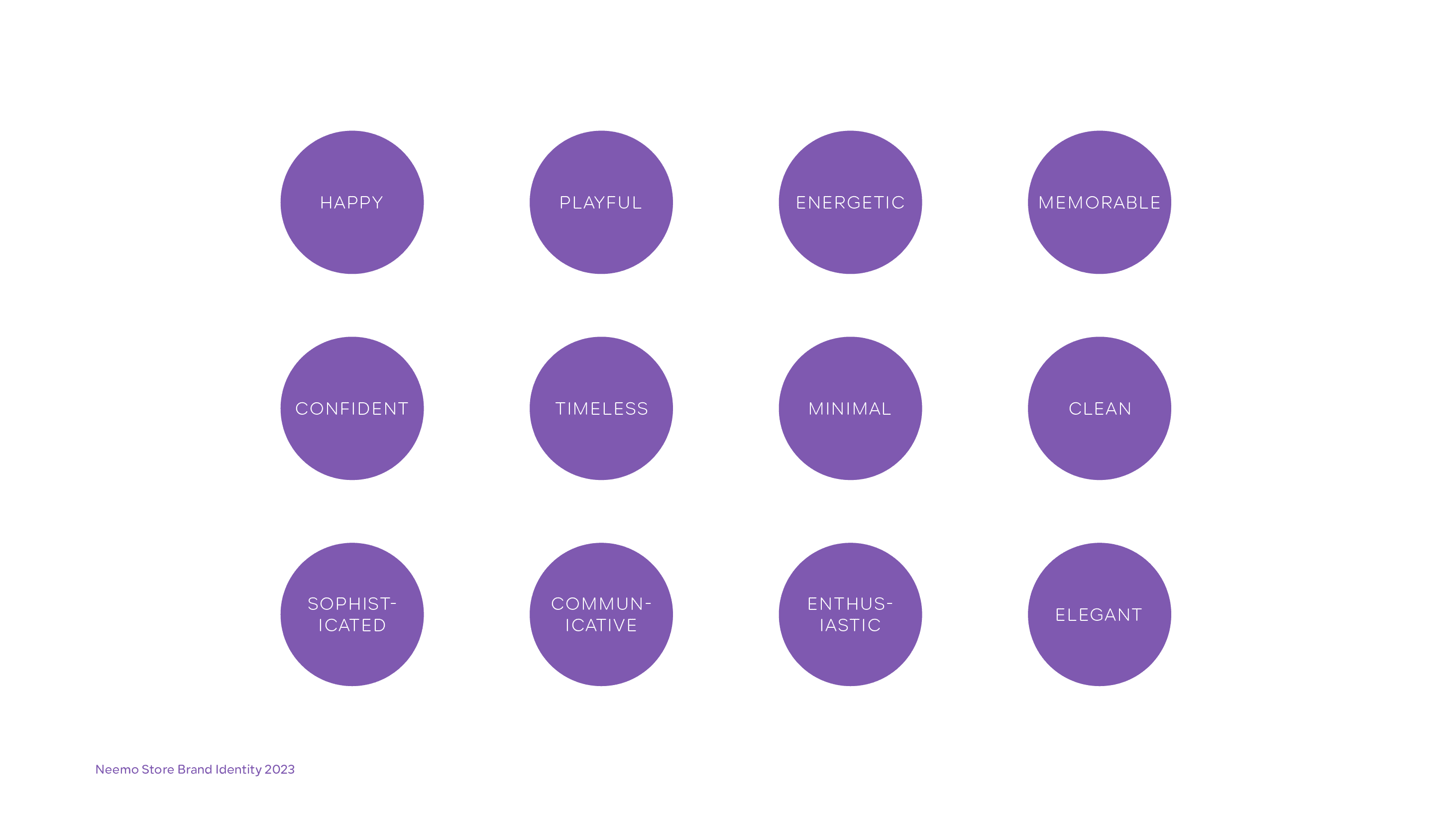
- 01حدّدنا شخصية العلامة كـ 'مبهجة، جريئة، ومفاجئة' - متجر حيث التسوّق يبدو كمكافأة
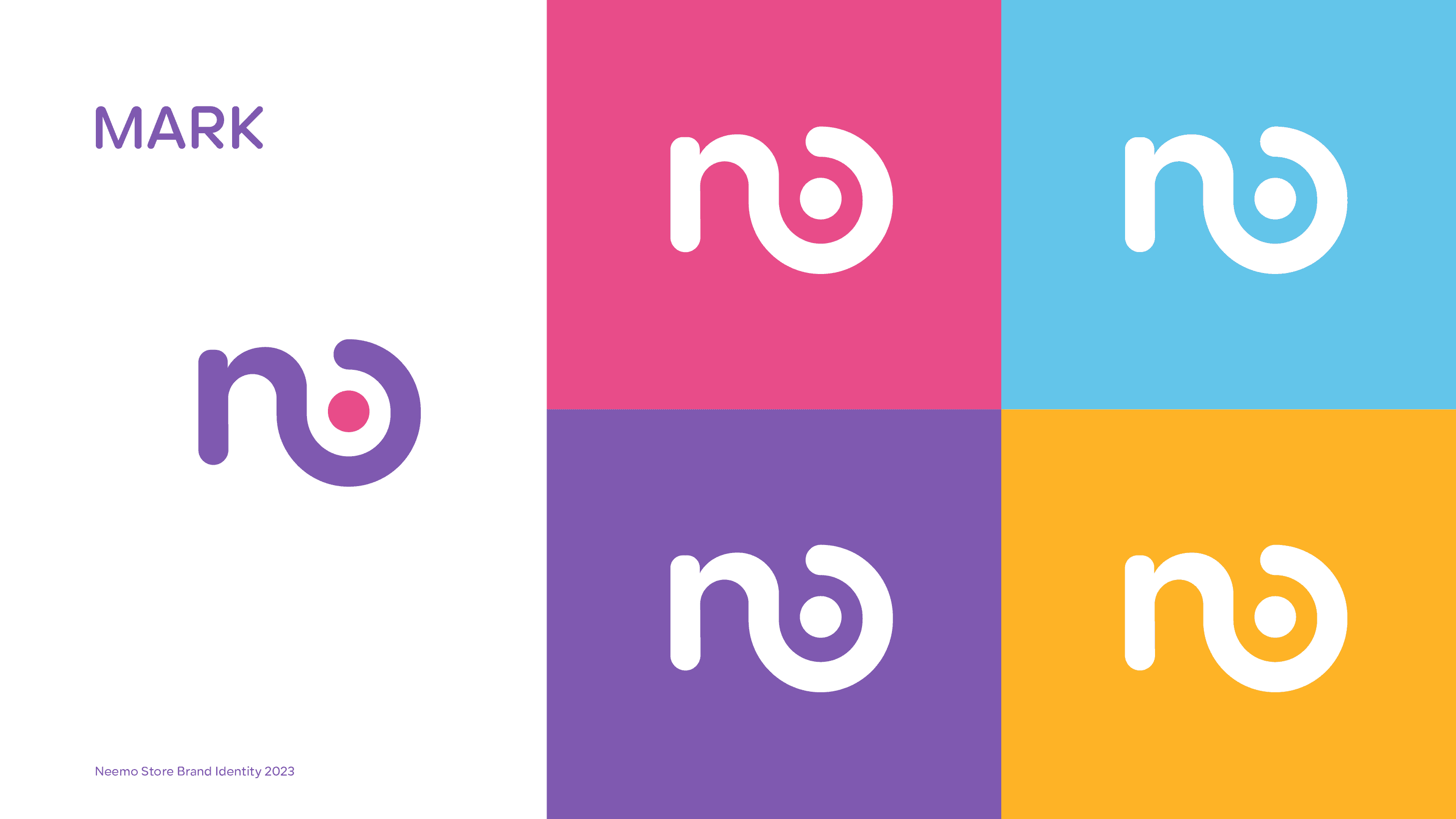
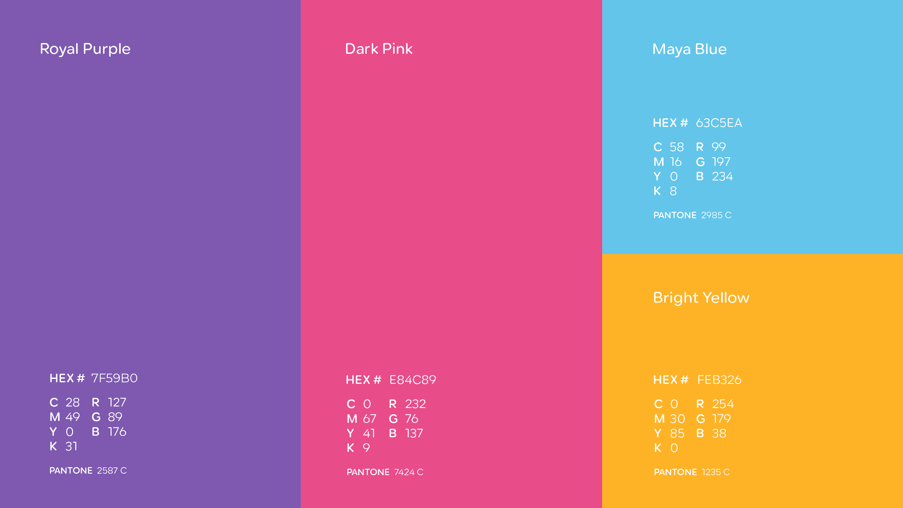
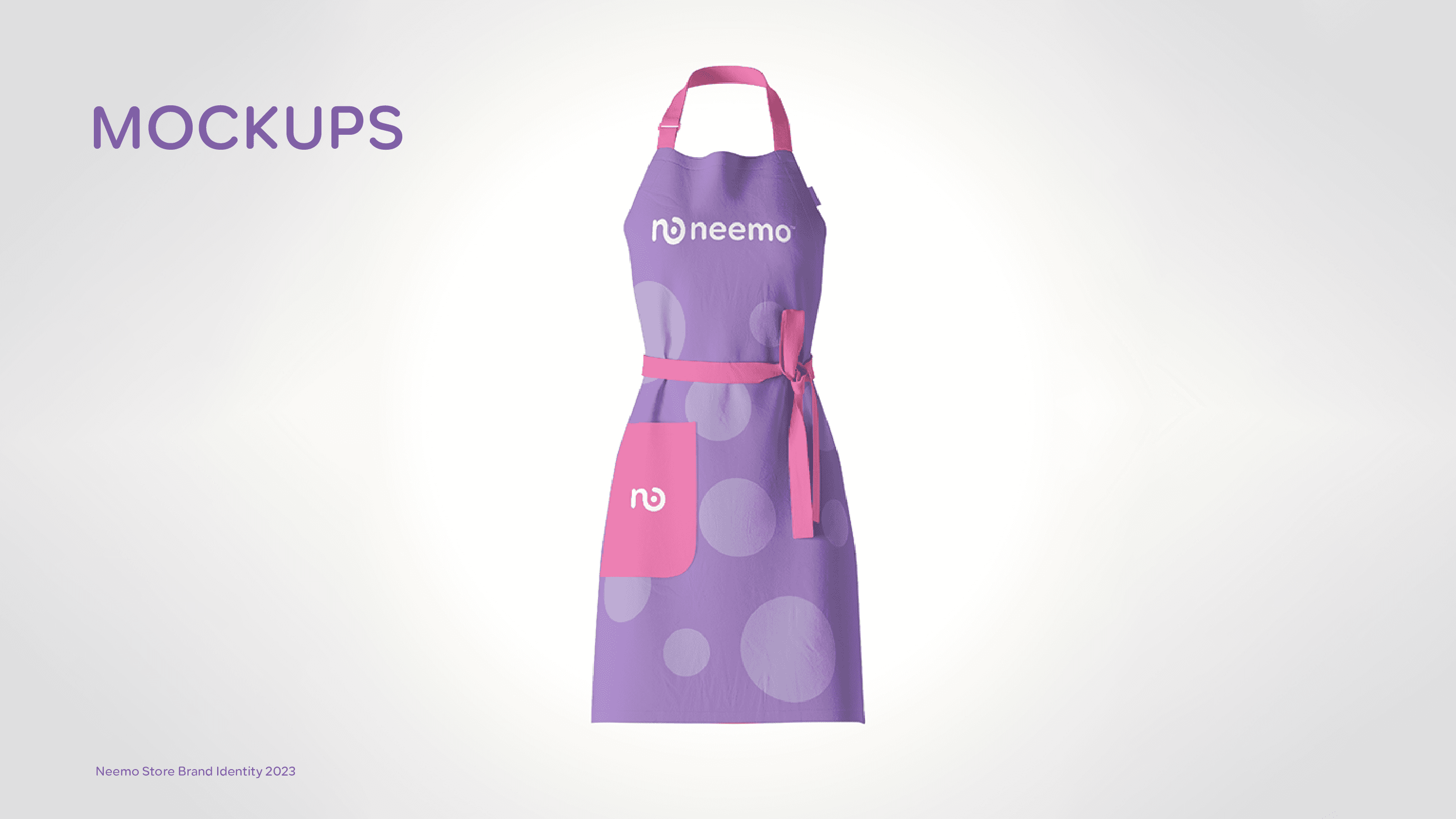
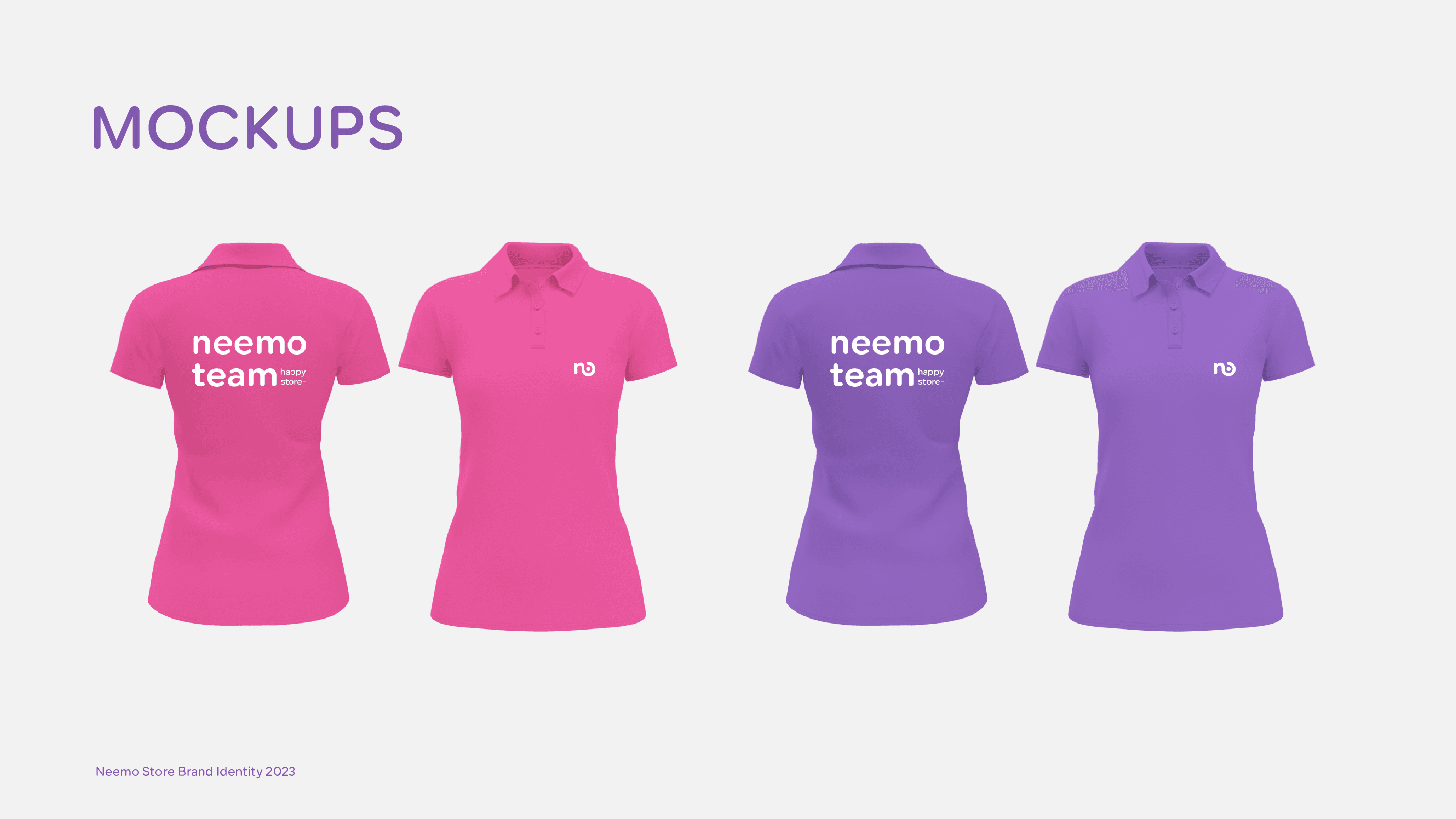
- 02كسرنا عُرف التجارة الإلكترونية بلوحة ألوان رباعية (بنفسجي ملكي، وردي داكن، أزرق مايا، أصفر ساطع) يستحيل الخلط بينها وبين أي منافس
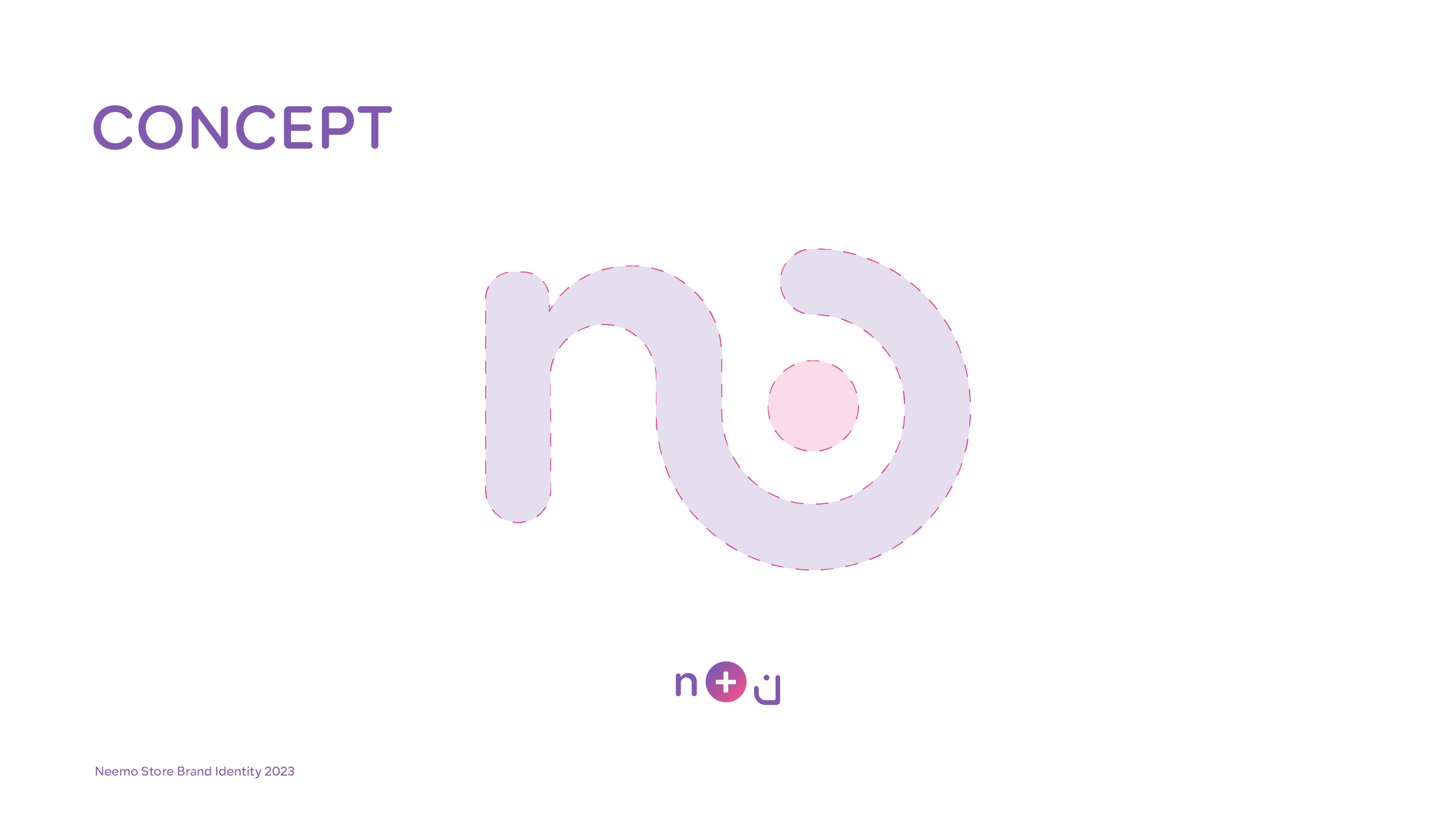
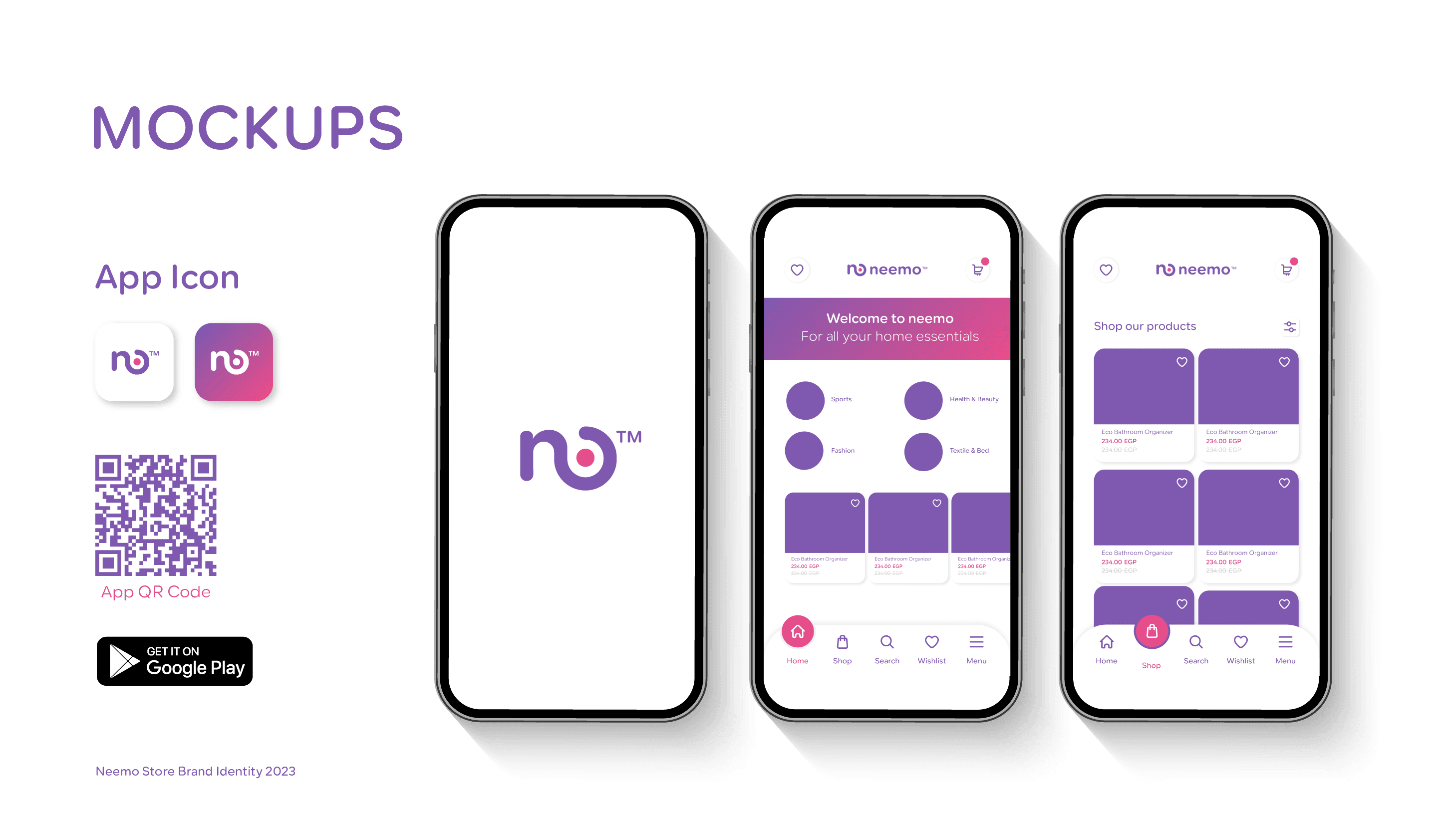
- 03صمّمنا رمز الشعار ليكون معروفًا فوريًّا بأي حجم - من أيقونة تطبيق 32 بكسل إلى لافتات خارجية
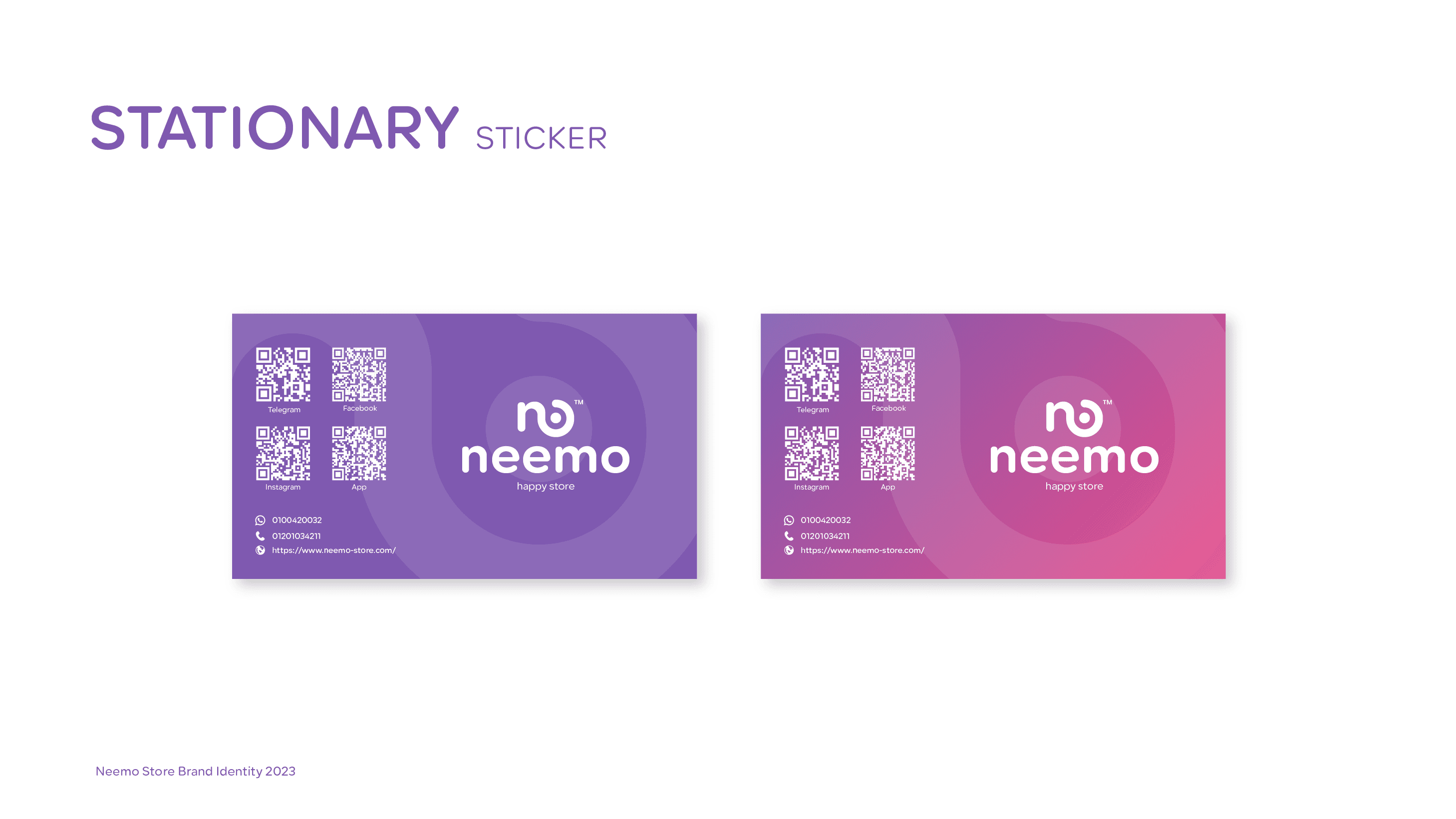
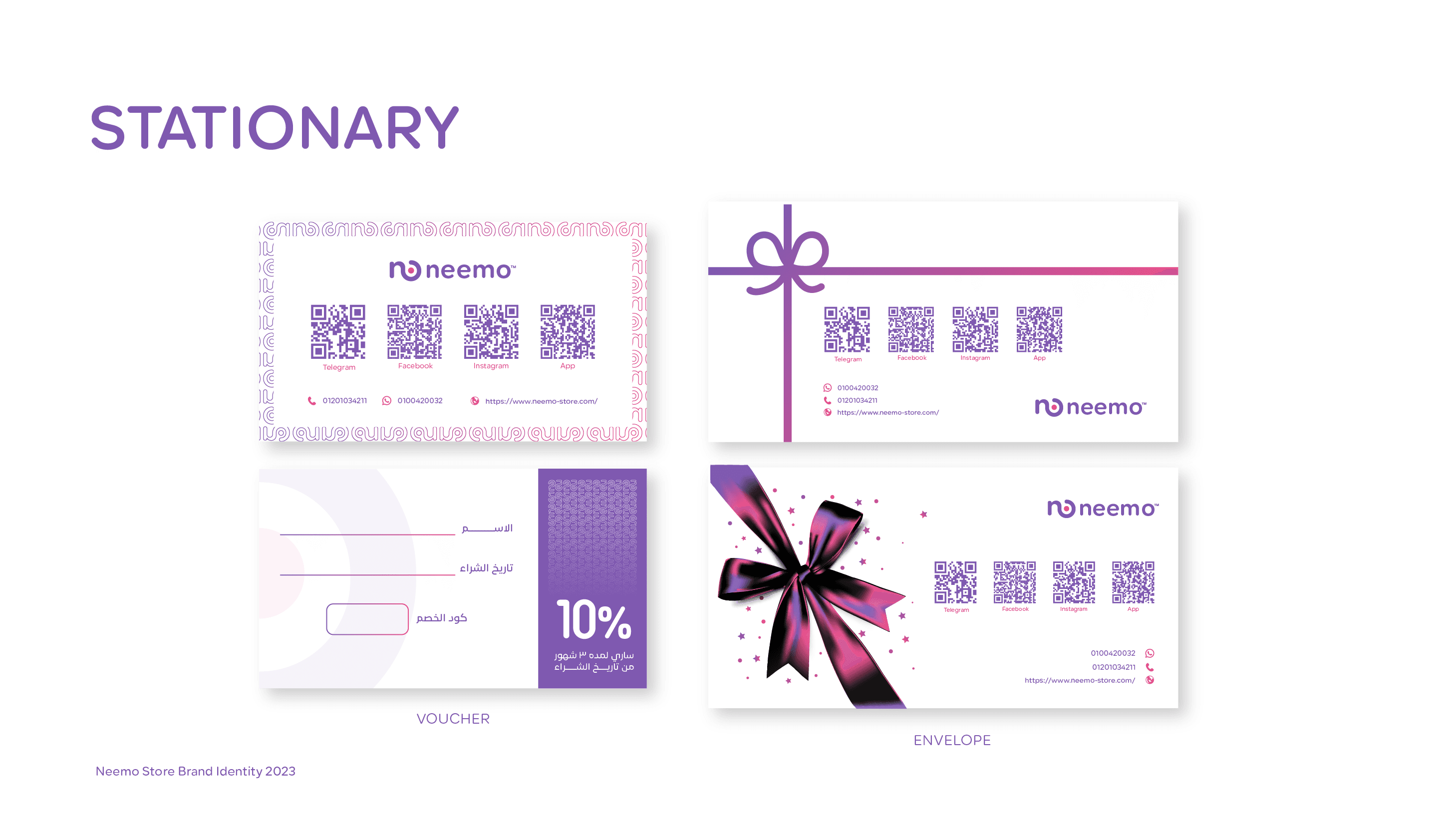
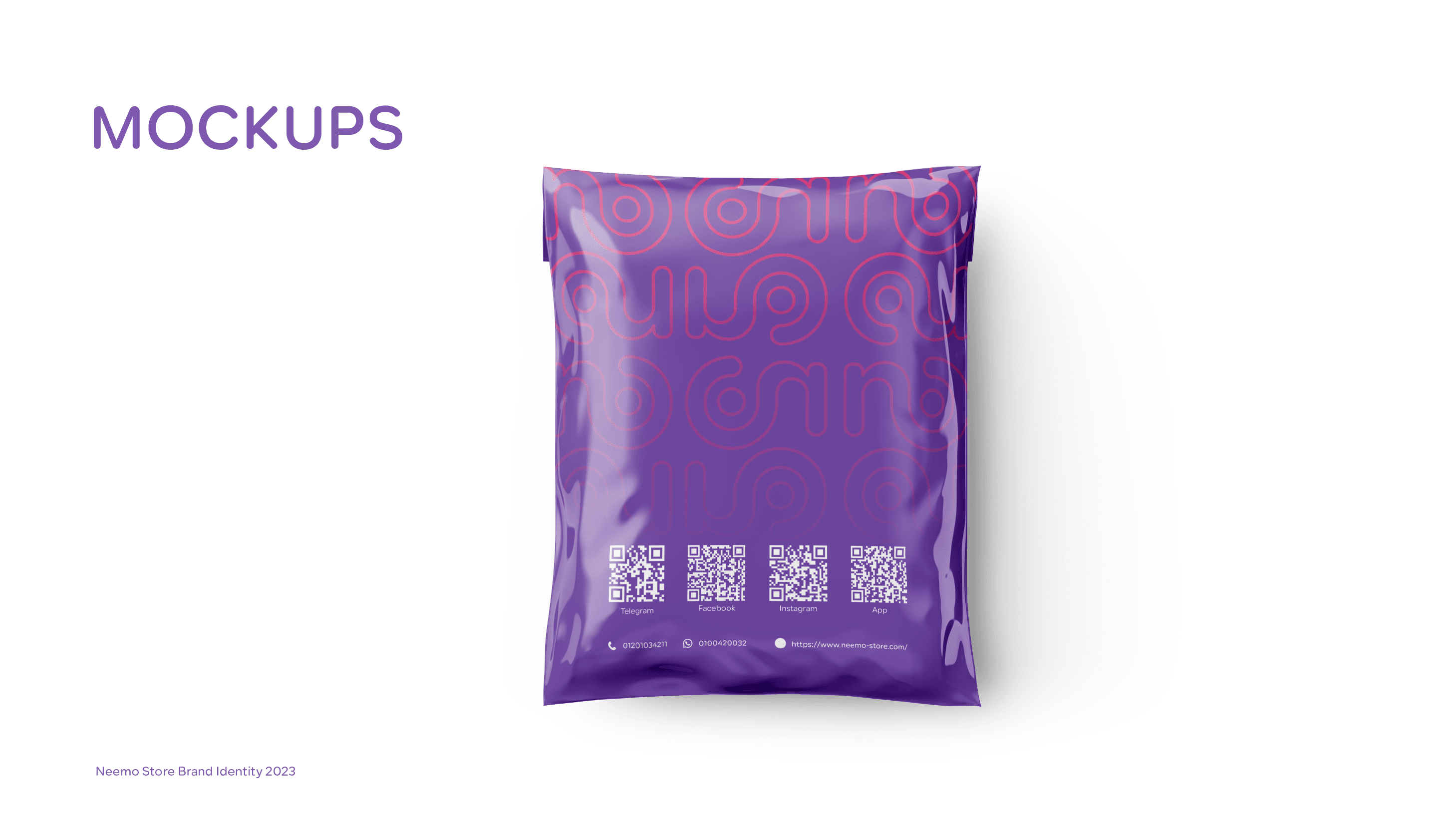
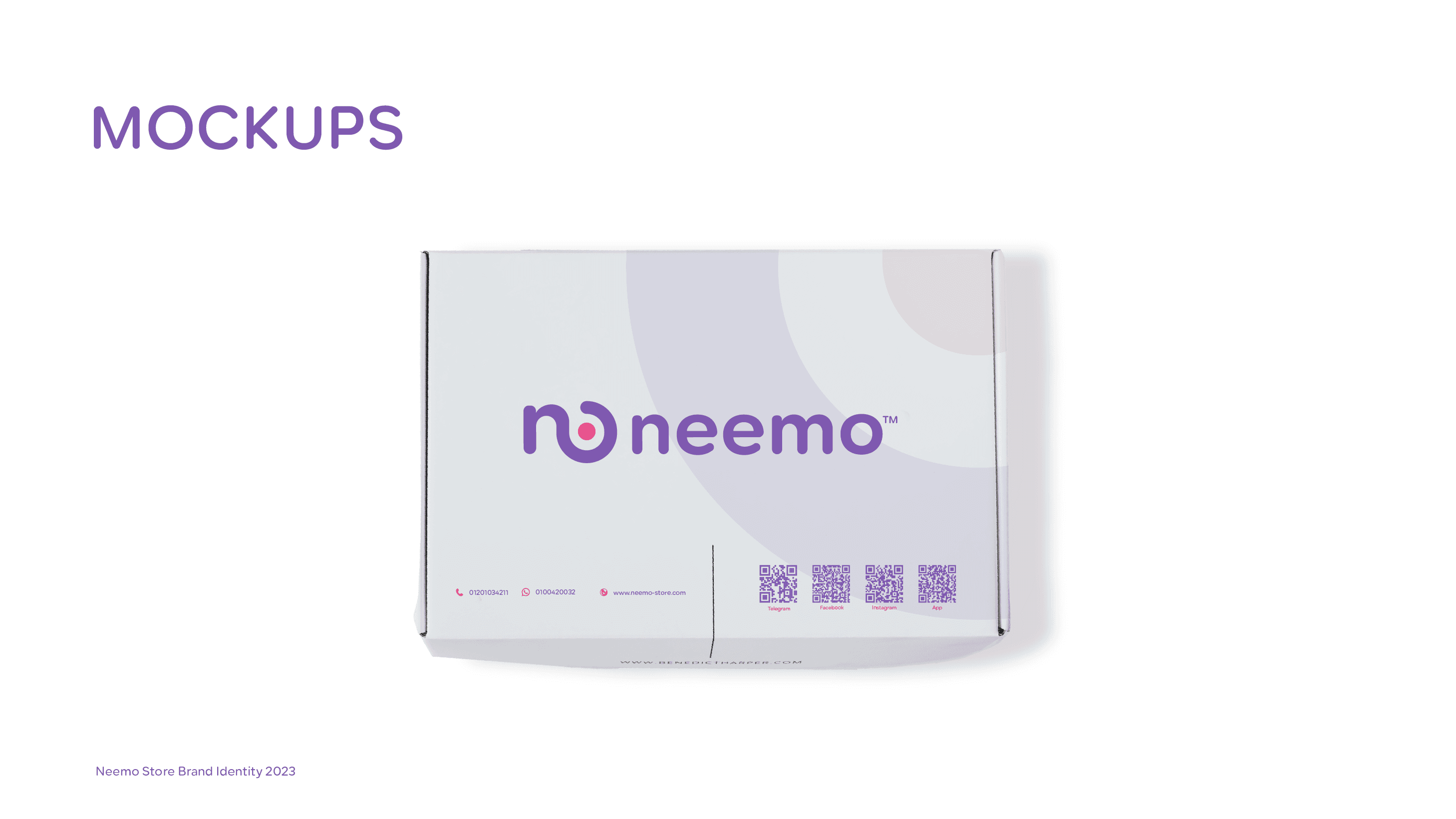
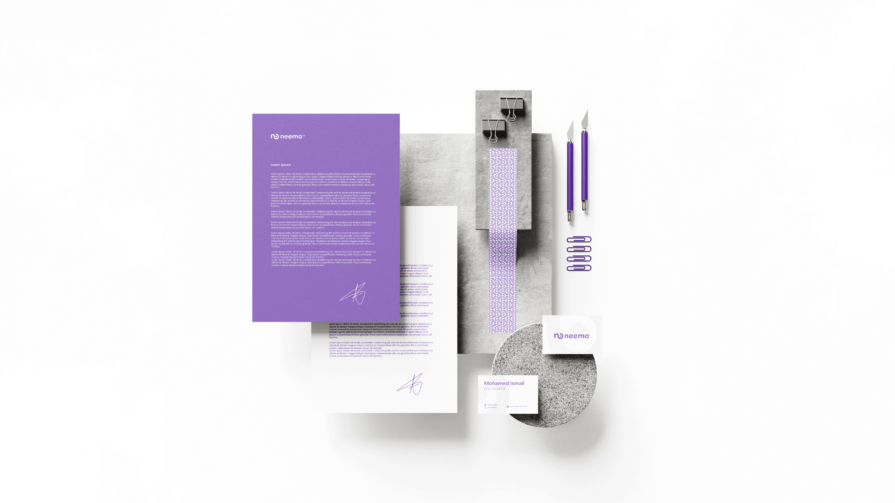
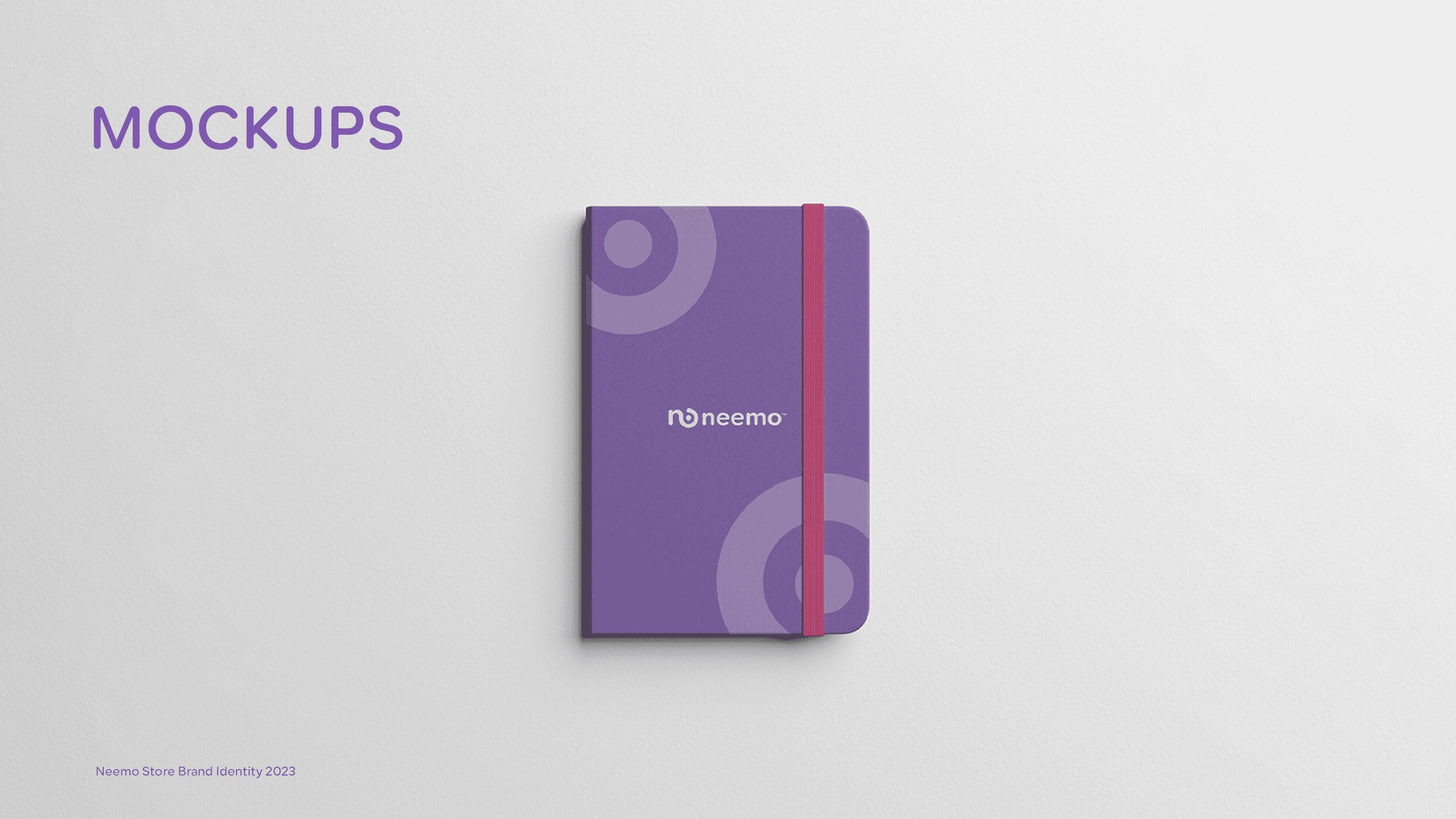
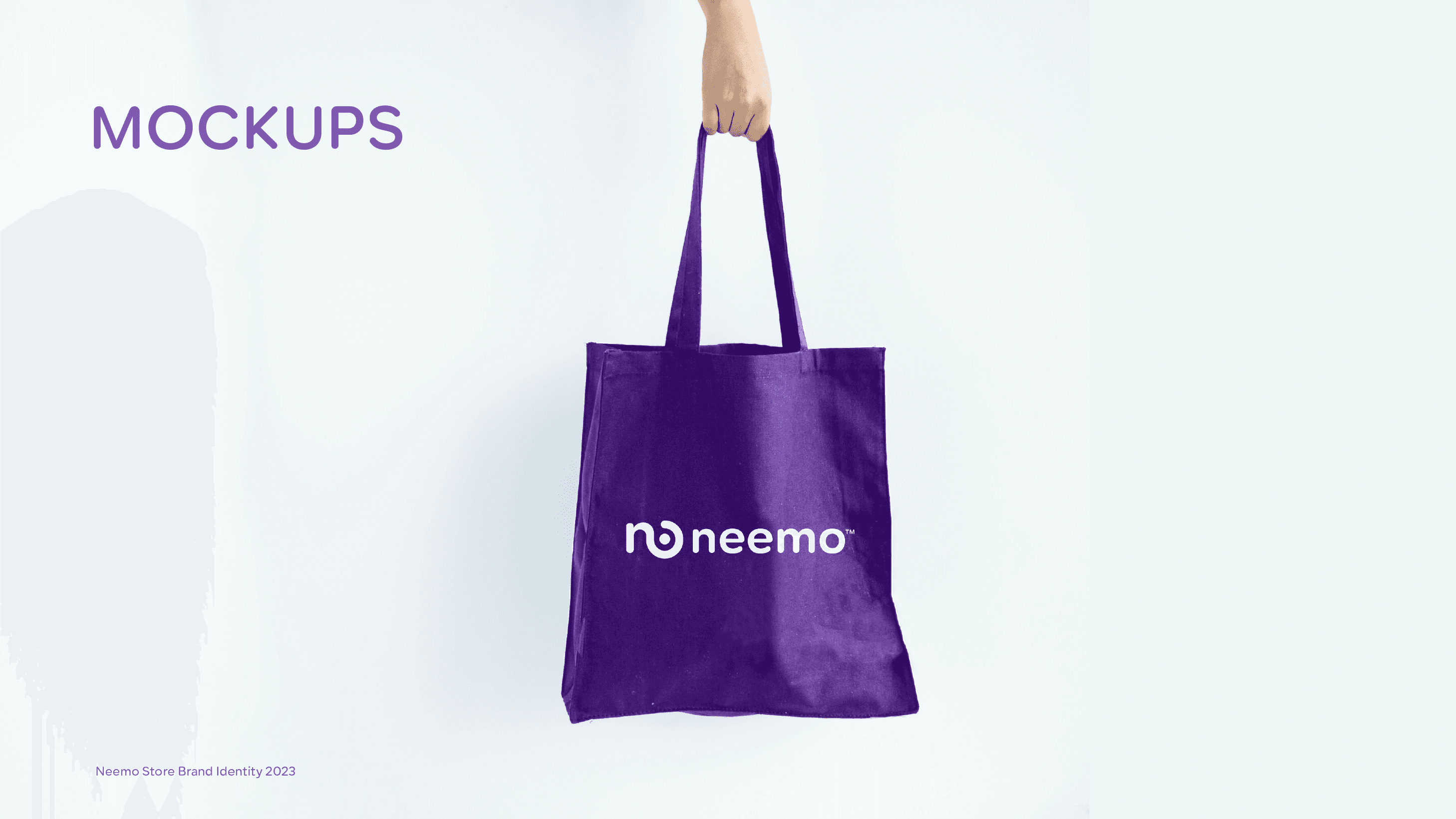
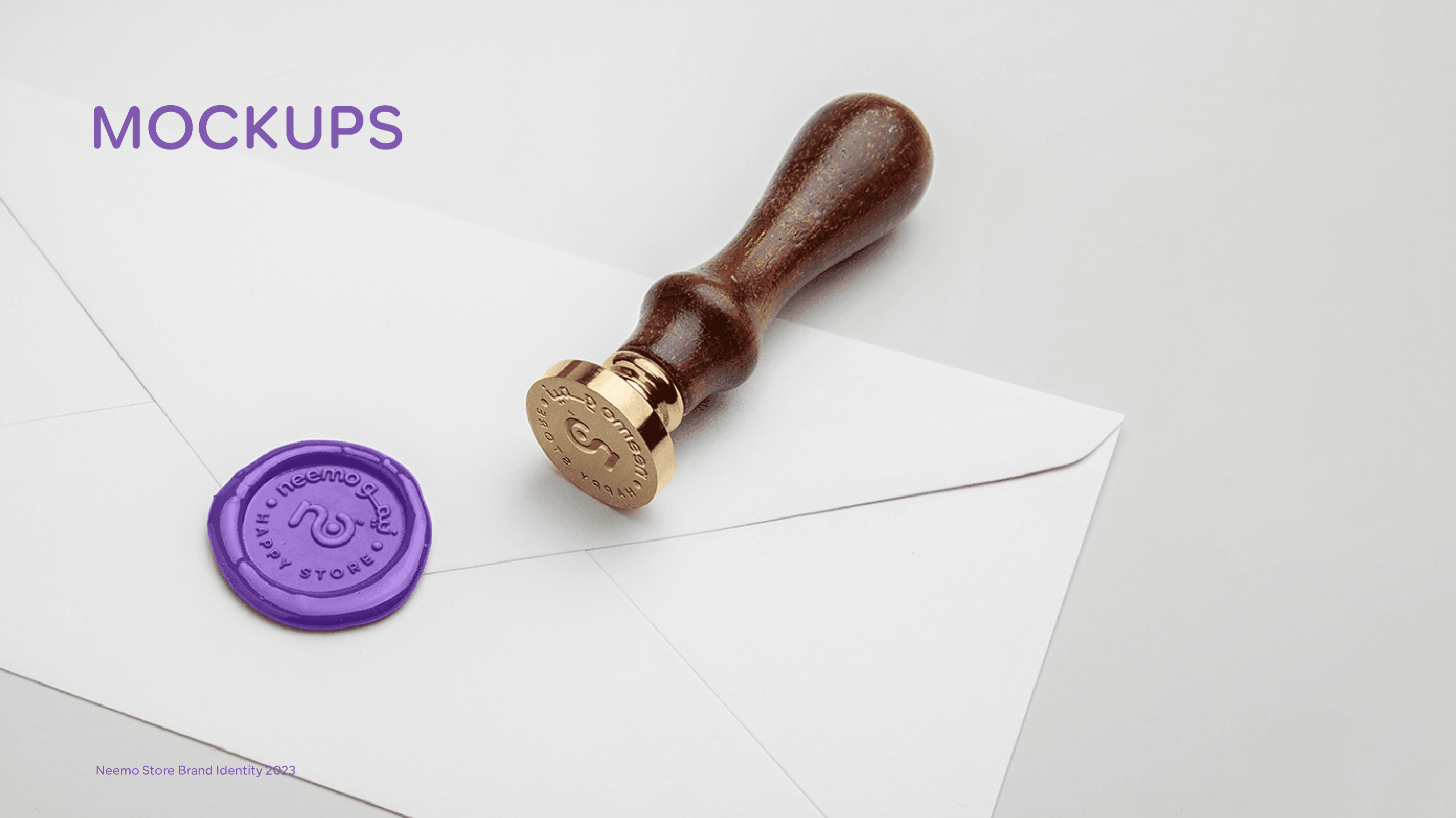
- 04تعاملنا مع التغليف كنقطة تماس للعلامة، لا كفكرة لاحقة - لأن الفتح هو أول لحظة فعلية يعيشها العميل مع العلامة
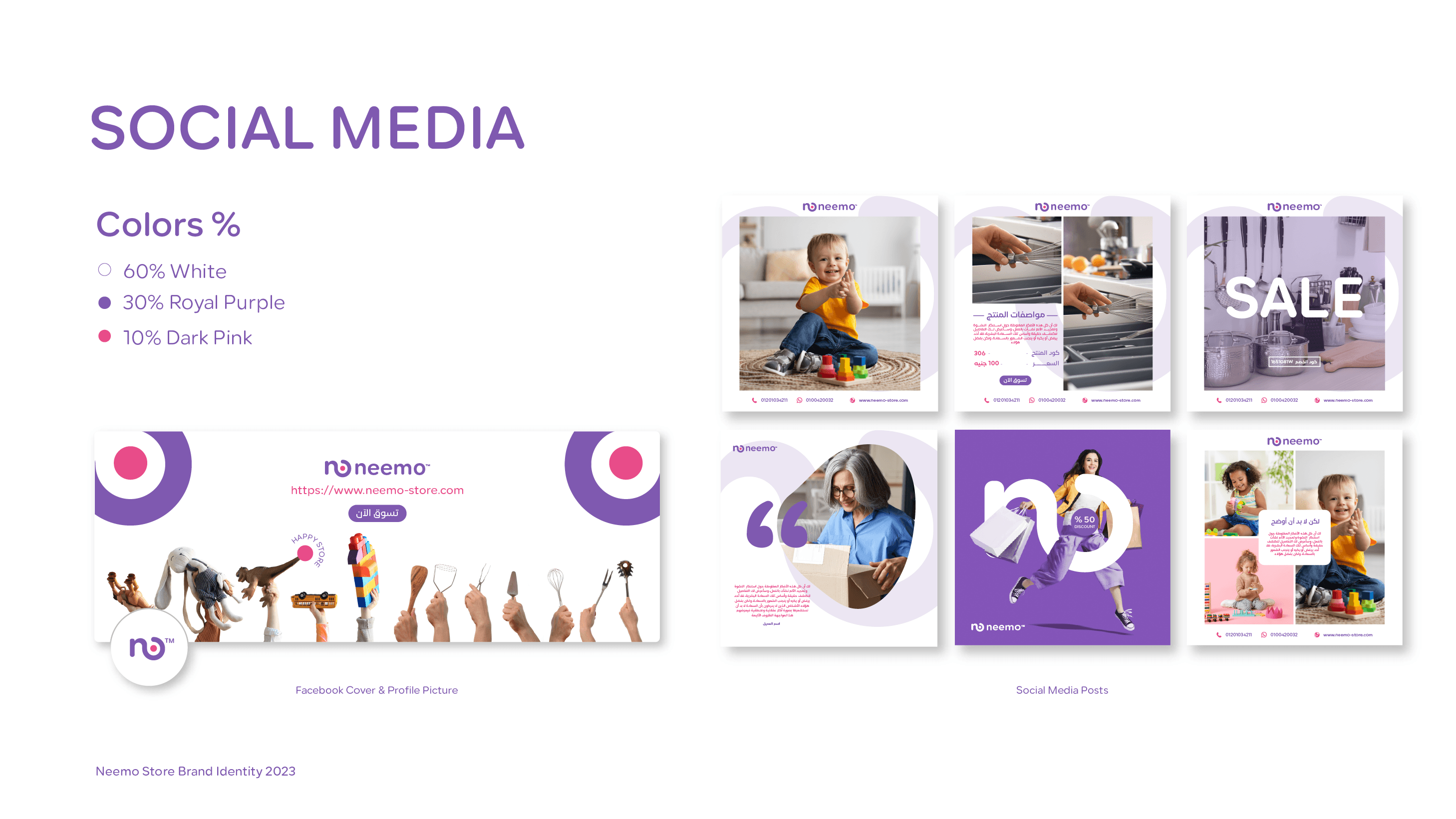
- 05بنينا قوالب تواصل اجتماعي تحافظ على اتساق العلامة مع السماح بتنوّع كافٍ لإبقاء المحتوى مُنعشًا
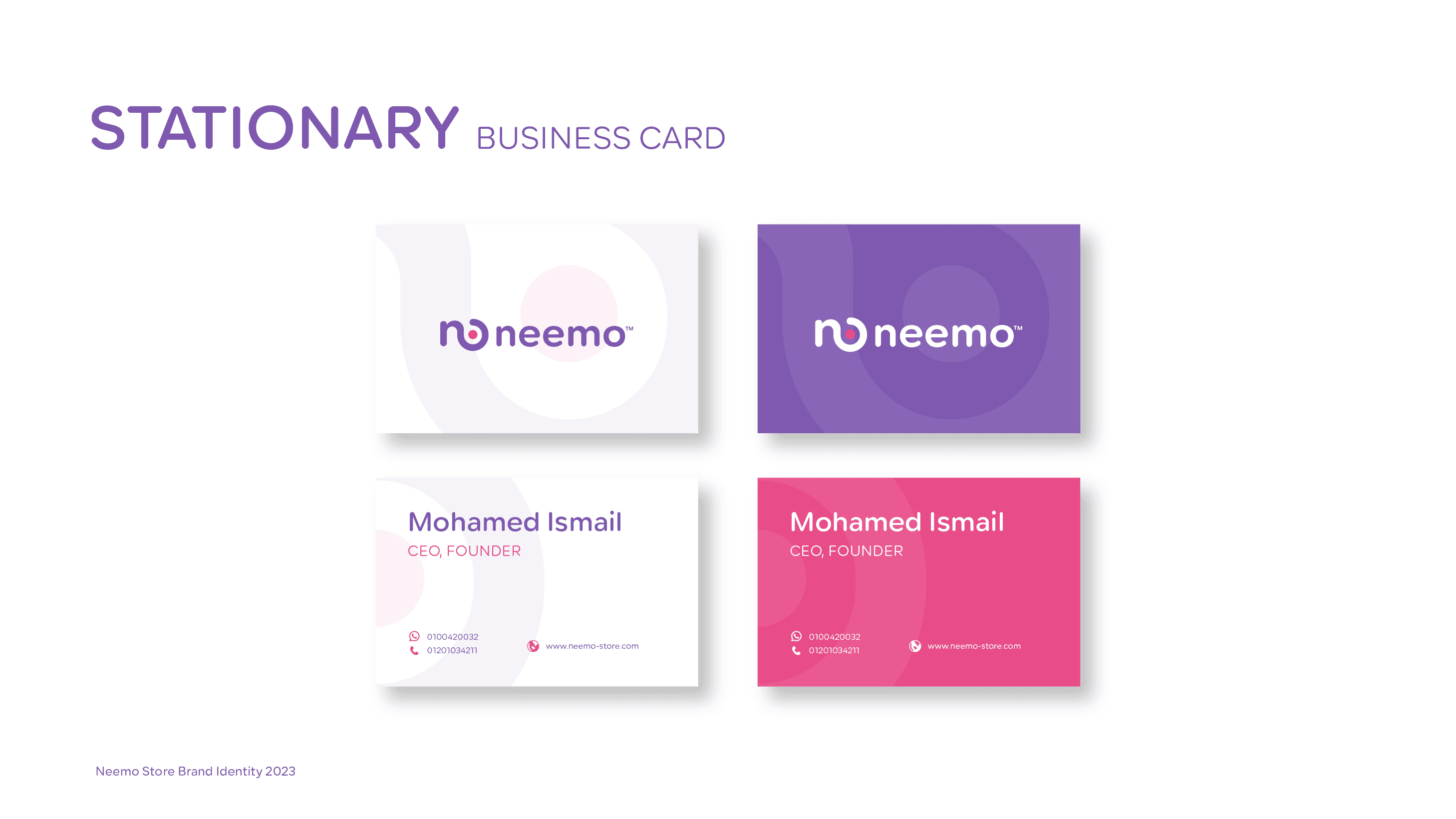
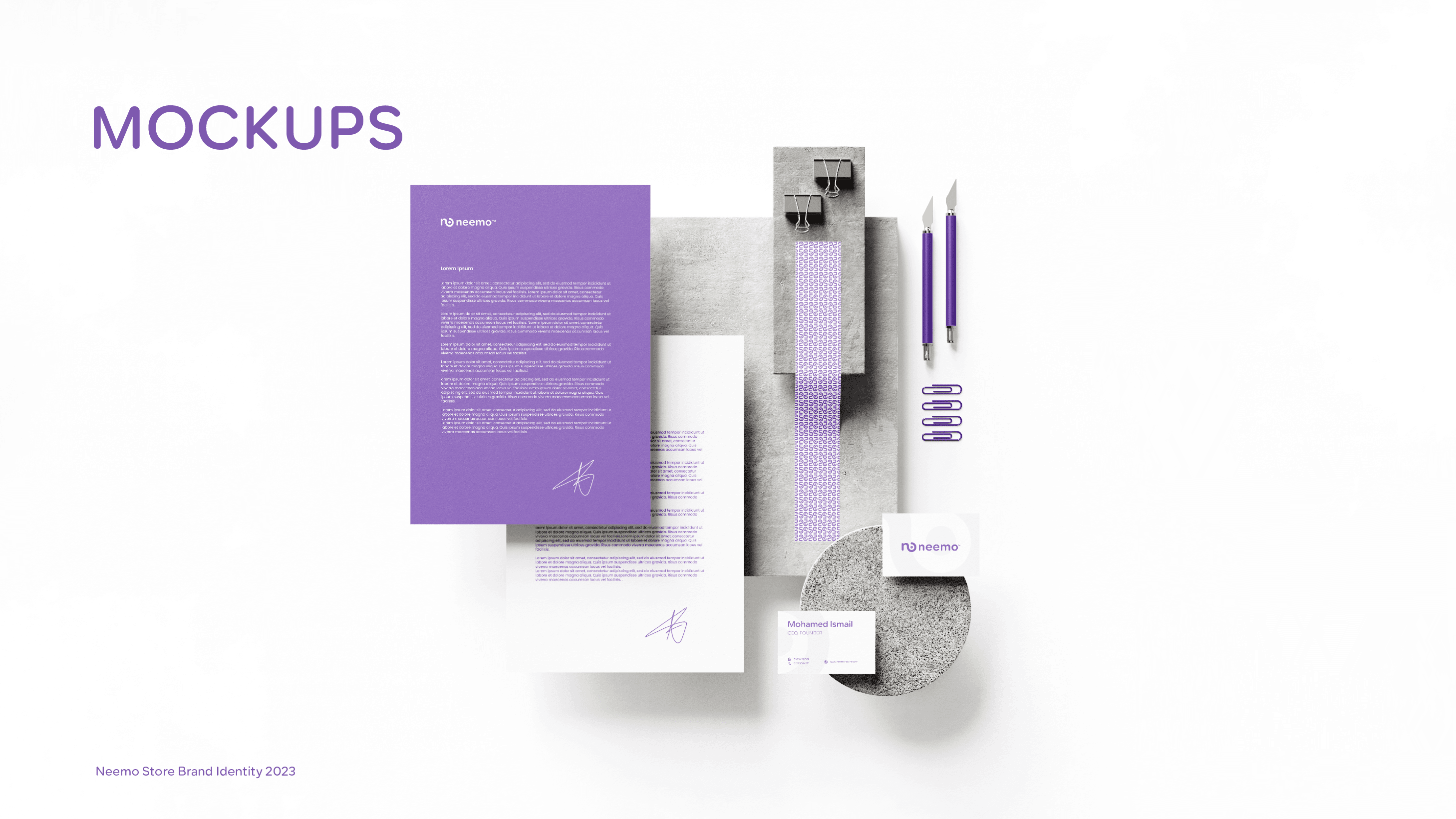
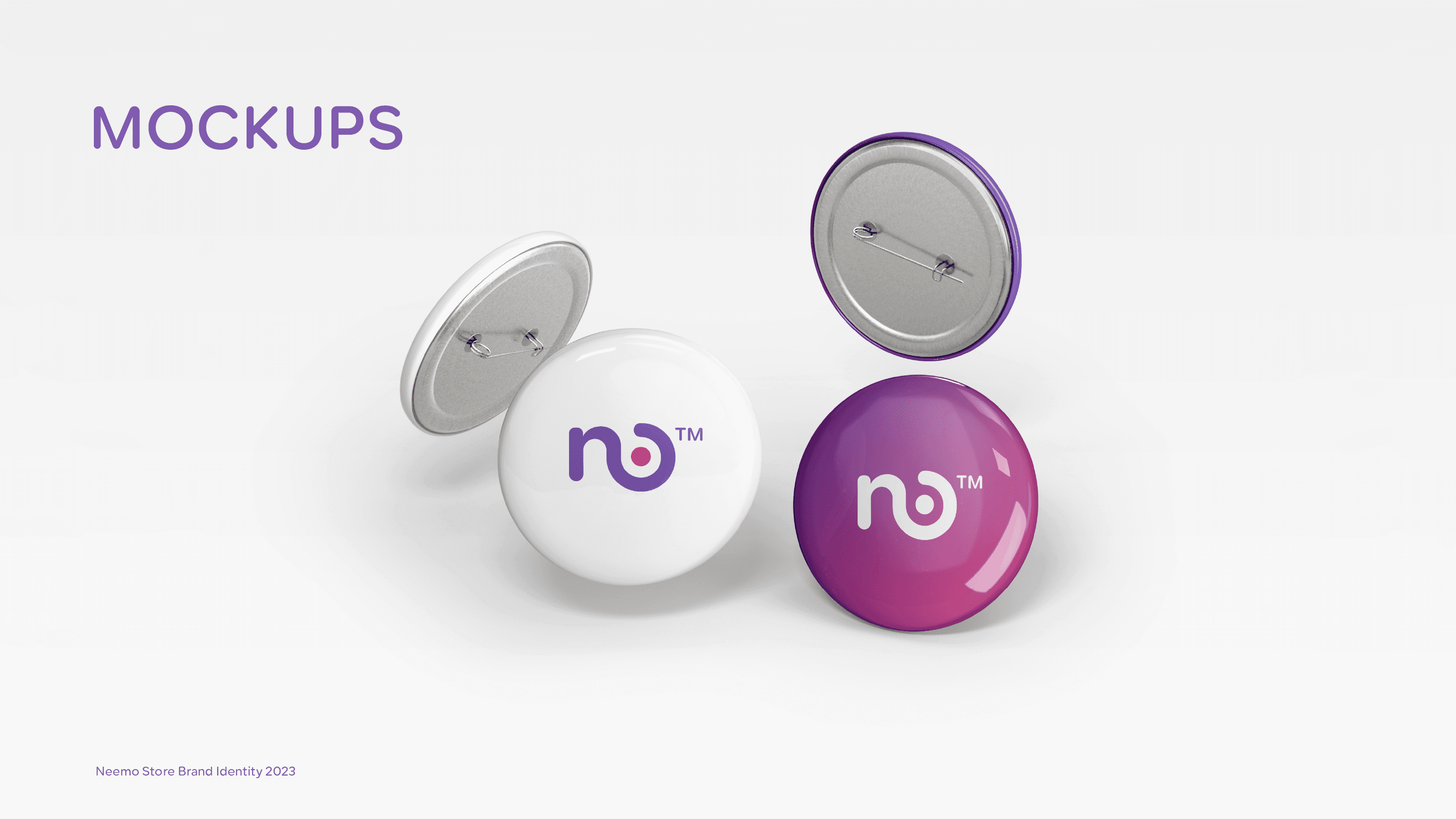
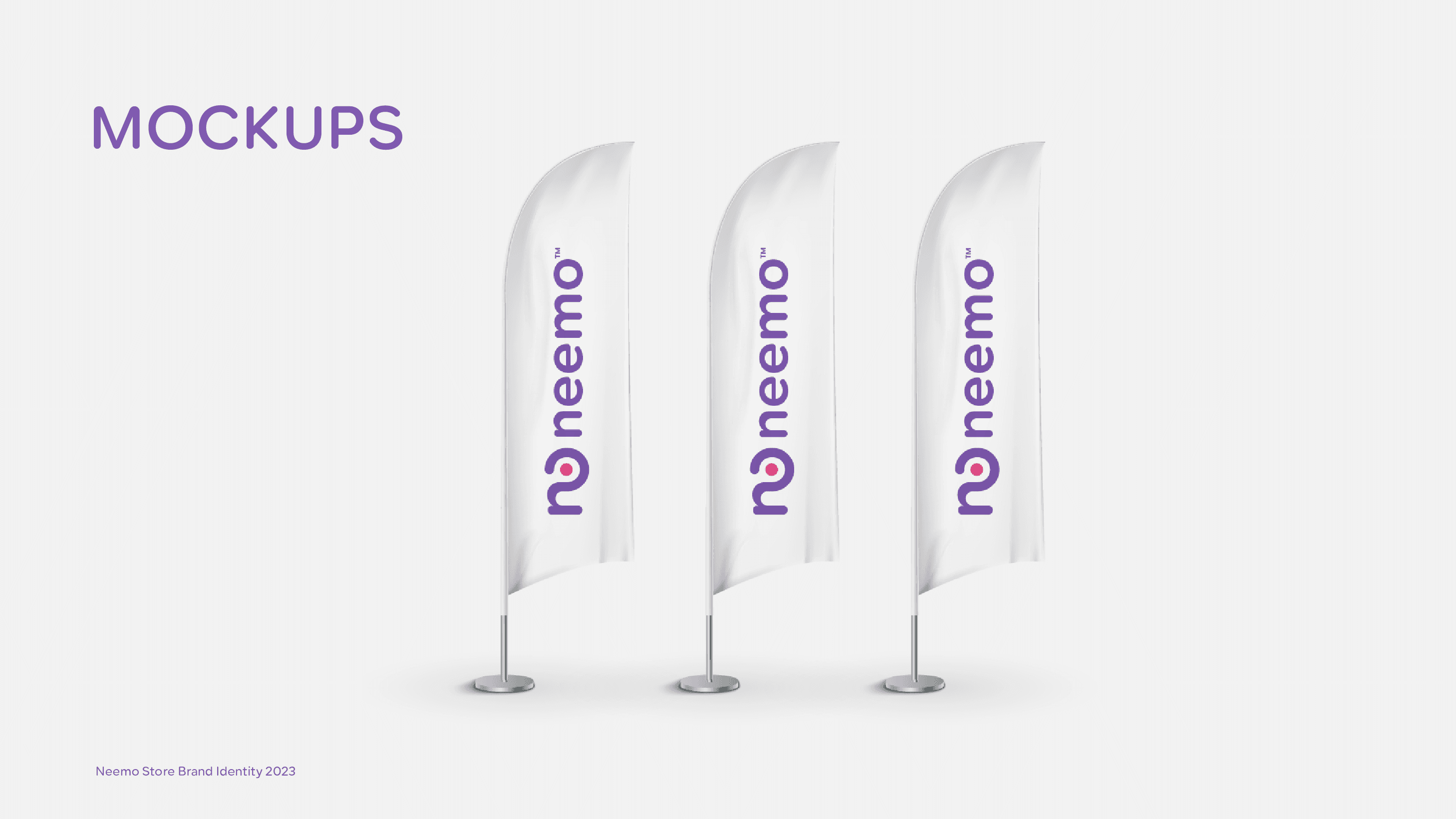
ما سلّمناه
النتيجة
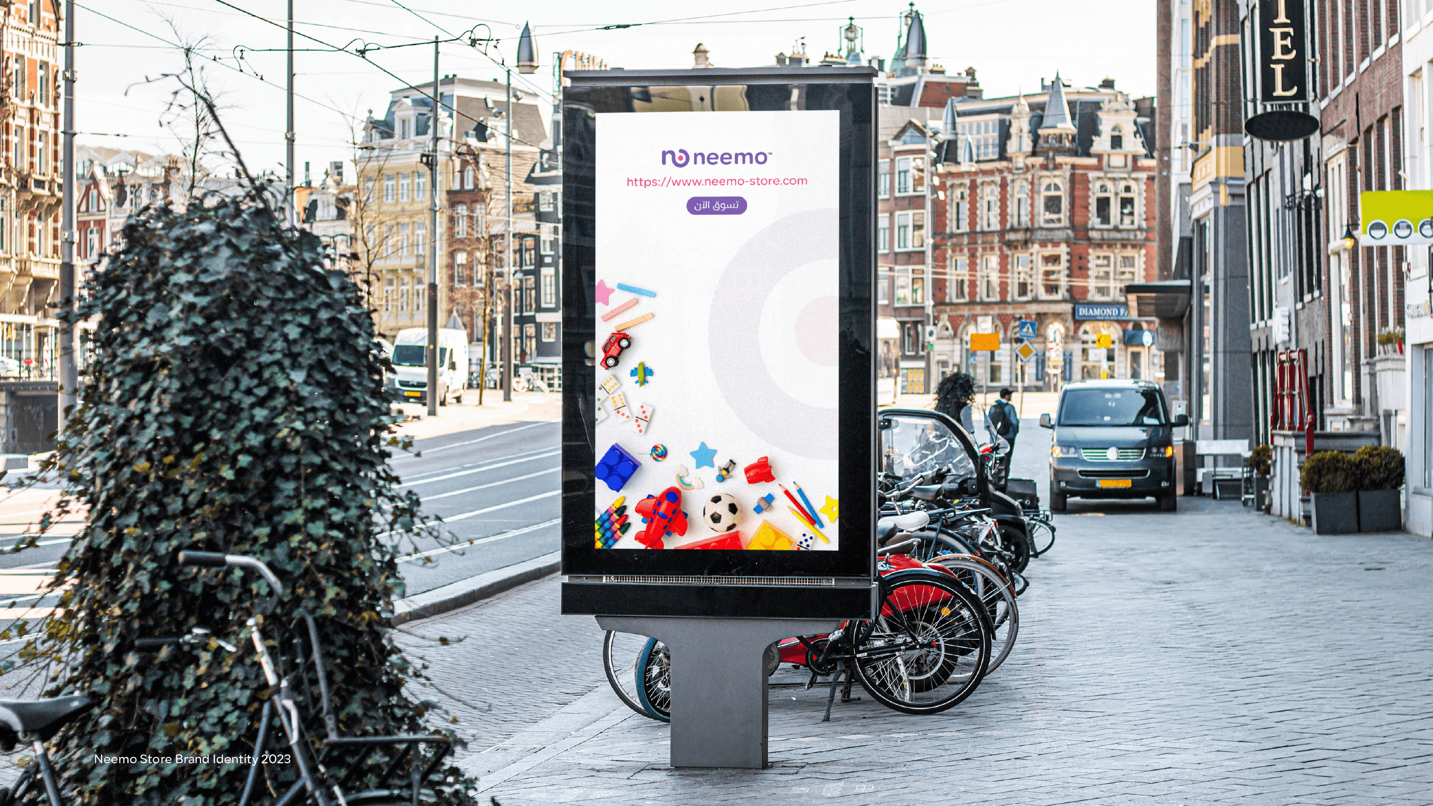
انطلق نيمو بهوية لا تشبه أي شيء آخر في فئته حقًّا. نظام الألوان الرباعي يكسر كل قاعدة تصميم تجارة إلكترونية 'آمنة' - ولهذا ينجح. في محتوى مليء بصور منتجات بخلفيات بيضاء بسيطة، بنفسجي وردي وأصفر نيمو يوقف التمرير.
تسليم نظام العلامة الكامل واعتماده ضمن الجدول الزمني
الهوية مميّزة بما يكفي للتعرّف عليها من التغليف وحده - قبل أن يفتح العميل المنتج
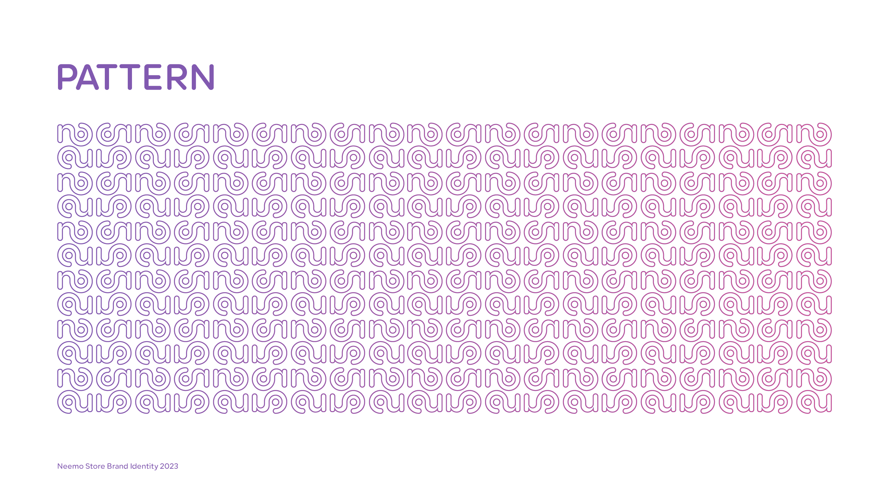
يمنح النظام البصري العلامة تنوّعًا كافيًا للنشر يوميًّا دون أن يبدو متكرّرًا، مع الحفاظ على التعرّف الفوري
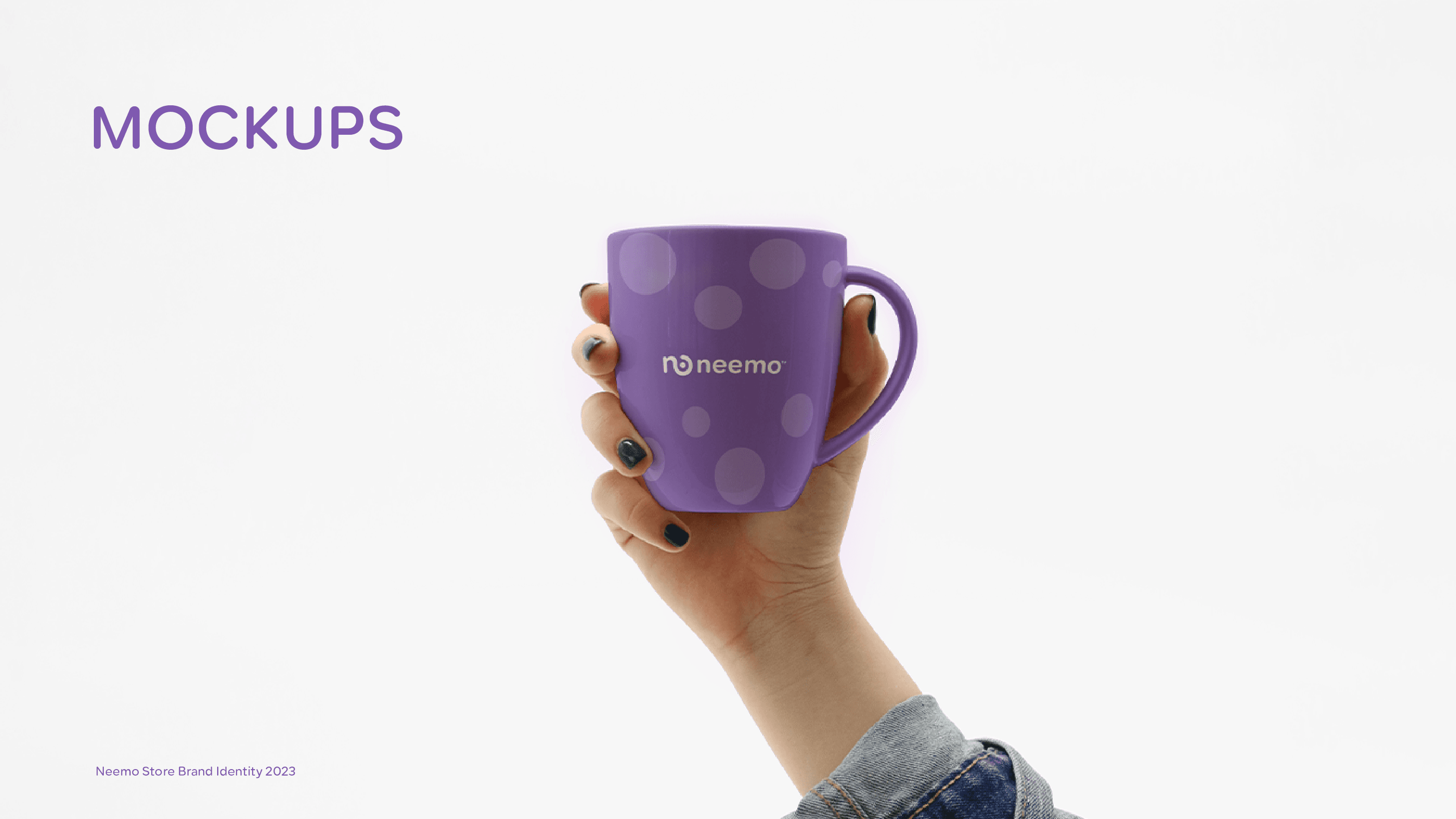
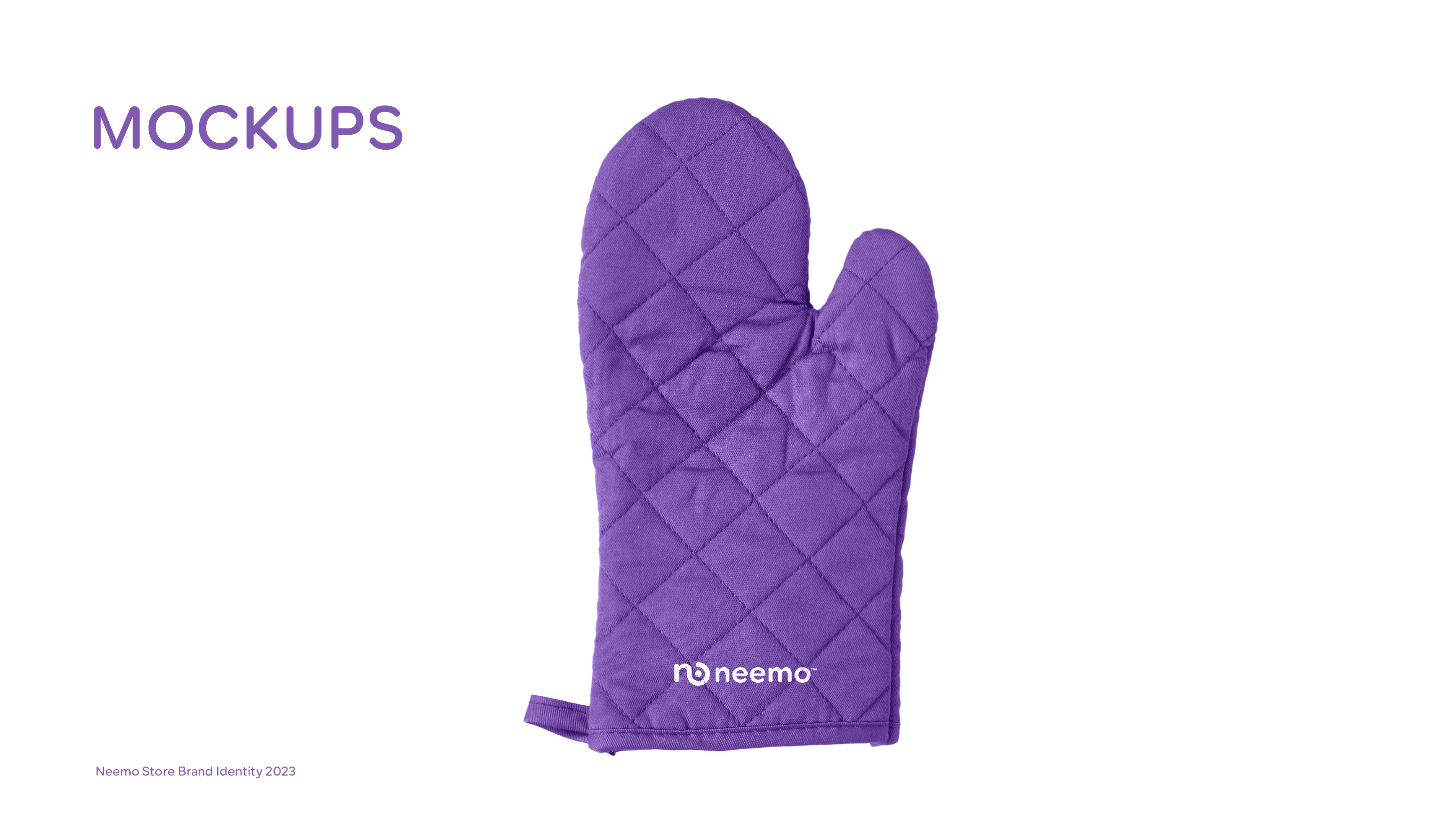
تصميم التغليف يحوّل كل عملية توصيل إلى لحظة علامة - يرى العملاء العلامة قبل أن يروا المنتج
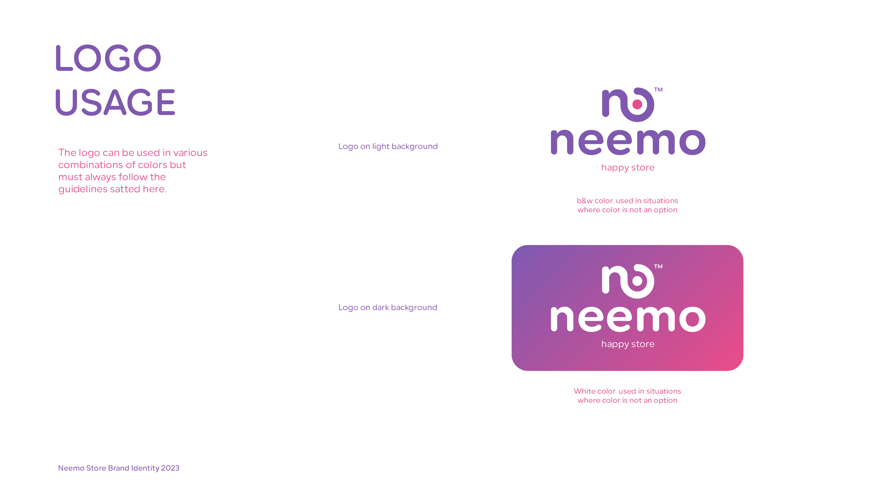
لوحة الألوان الرباعية.
معظم أدلّة العلامات تخبرك بالالتزام بلونين. كسرنا هذه القاعدة عمدًا لأن شخصية نيمو تتطلّبها - 'السعادة' لا تأتي من لون واحد، بل من طاقة الألوان المتعدّدة. المفتاح كان بناء نسب استخدام صارمة حتى يخلق التنوّع حماسًا، لا فوضى.
ملف العرض الكامل
Mawaeidk
الرعاية الصحية / الصحة الرقمية